RecruiterPal UX Redesign
Overview
The team was tasked by our client, RecrutierPal to redesign and improve RecruiterPal’s presence online. The team conduct UX research to enhance user experience, improve the on-boarding process, brand differentiation and product communication. Through communicating with the client, the team conducted content strategy and proposed a prototype website for RecruiterPal to further develop.
Time
3 weeks
Tools
Adobe XD
Role
UX Researcher
UI Desginer
Methodologies
• Personas
• Customer Journey Mapping
• User interviews
• Contextual Inquiry
• Heuristic Analysis
• Competitive Analysis
• Information Architecture(IA),
• Sitemaps
• User Flow
• Visual Design
• Content Audit
• Affinity Mapping
• Wireframing
• Prototyping
• Usability Testing
The Brief
• To conduct a critical review of the RecruiterPal website
• To determine the clarity of message
○ “Are we being clear enough on what each product does?” (Employer software vs Recruiter software)
• To conduct a competitor analysis
○ “How is our brand message differentiated and performing vis-à-vis our competitors?”
• To map out the customer journey of experiencing the website, leading up to a signup
Design Goals
To improve the ability of the RecruiterPal website to:
• Clearly communicate what the RecruiterPal platforms are and how they can meet recruitment needs and challenges
• Capture contact information of interested users
• Differentiate themselves from competitors via brand identity
The Plan
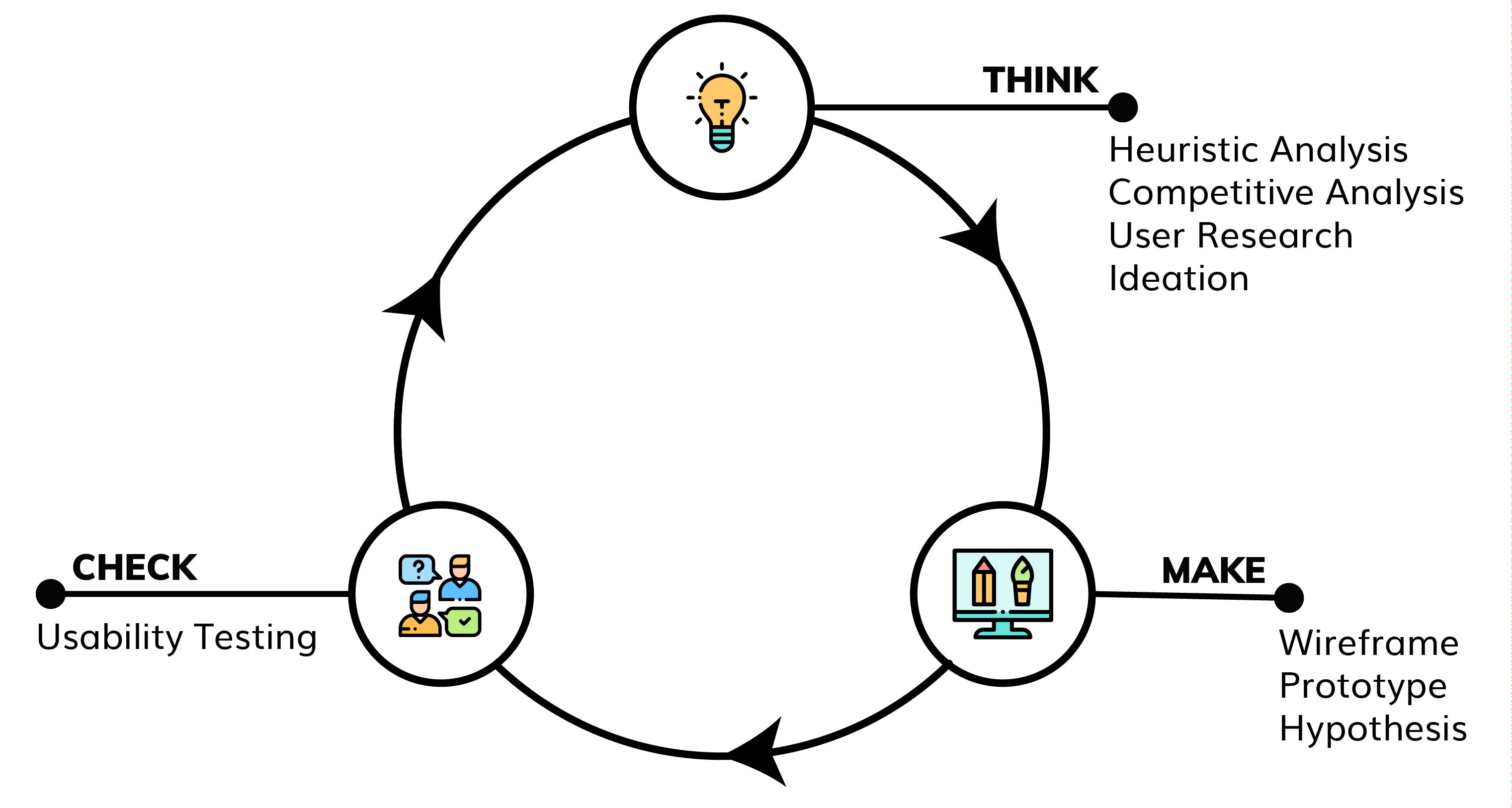
The team utilised a framework called “Lean UX” where development is conducted in rapid bursts. It is a cyclic process that pushes the team to design iteratively. The iterative process is guided by user testing after every design change allowing the team to test assumptions rapidly.
*Heuristic Analysis, Competitive Analysis and User & Business Research was mostly done during the first cycle at the beginning of the process*

Think
HEURISTIC EVALUATION
Utilising Jakob Nielsen’s 10 Usability Heuristics for User Interface Design, the team began analysing the app. The team generated a research report for the client, the summary is given below.
“Key issues stemmed largely due to the lack of clarity behind the content provided and the occasional disruption of user flow in the Products and Free Trial sections, confusing navigation at product pages and unclear purpose behind several Interactions available.
Part of the brief regarding this project was to increase the capture rate of contact information and increase the use of the website. While heuristic evaluations were able to identify areas that could be strengthened or improved, additional processes such as (and not limited to) competitive analyses and usability tests are needed to dive deeper into how we could develop the website to better meet RecruiterPal’s goals and visions.”
USER INTERVIEWS
To gain insights for both recruiters & HR employers behaviours, we conducted conducted exploratory interviews with individuals who matched RecruiterPal’s target audience. Gathering participants recruitment/hiring process, positive and negative experiences.
USABILITY TESTING
During this process we also conducted testing on the existing site and gathered feedback and areas for improvement
AFFINITY MAPPING
To aid us with analysing the findings, we synthesised our findings using Affinity Mapping. An excerpt from our process is shown below where we grouped the problems found. The team generated a research report for the client, the summary is given below.
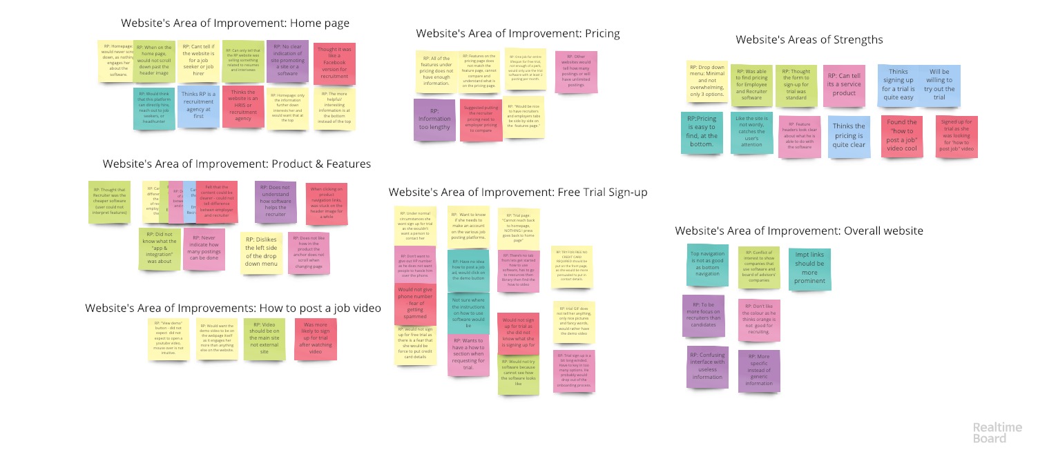
KEY FINDINGS
• Both HR & Recruiters use various job portals to find candidates.
• Interviewees expressed that it is very time consuming to post jobs on different job portals
• Interviewees enjoyed the process when instructions on job portals was clear and the process was relatively straight forward
• All users had difficulty telling what the website was promoting or selling
• Users could not differentiate between the Employer and Recruiter software.
• Users found the how-to-post-a-job video compelling and were more interested in the RecruiterPal after watching it.
COMPETITIVE ANALYSIS
Concurrently, the team analysed other similar websites to get a better understanding of what similar organisations are doing and draw inspiration from what they were doing well. The four websites analysed were Lever, Workable, Greenhouse and Jobadder. The team generated a research report for the client, the summary is given below
“Through analyzing several of our competitors’ websites, we were able to identify common practices such as:
• Clean, organized and visually pleasant layout
• Screenshots to accompany descriptions of their products
• Comprehensive resource sections
• Posts often include webinars, articles related to the product and articles about recruitment in general
• Articles provided are often easy to read and understand
• Users who did not purchase the software can still access
• Search and filter/categories functions available
• Significant amounts of “call to action” buttons to encourage users to try the product
• A mixture of icon, visuals and screenshots to portray how the software will look, but still maintain a sense of consistency
Based on our earlier heuristic evaluations, we know that the RecruiterPal website already implemented several of these patterns found in our competitors’ websites. By building on the RecruiterPal’s websites areas of strengths while correcting its areas of improvements, we can increase RecruiterPal’s ability to optimize and meet its organizations goals and visions.”
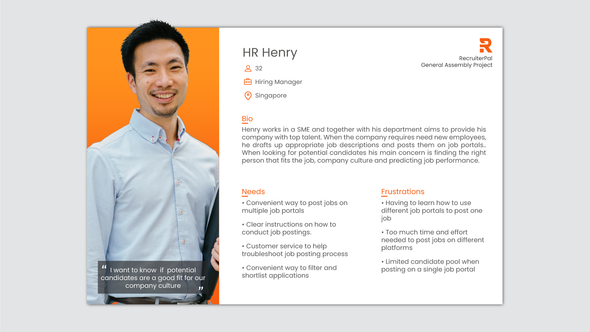
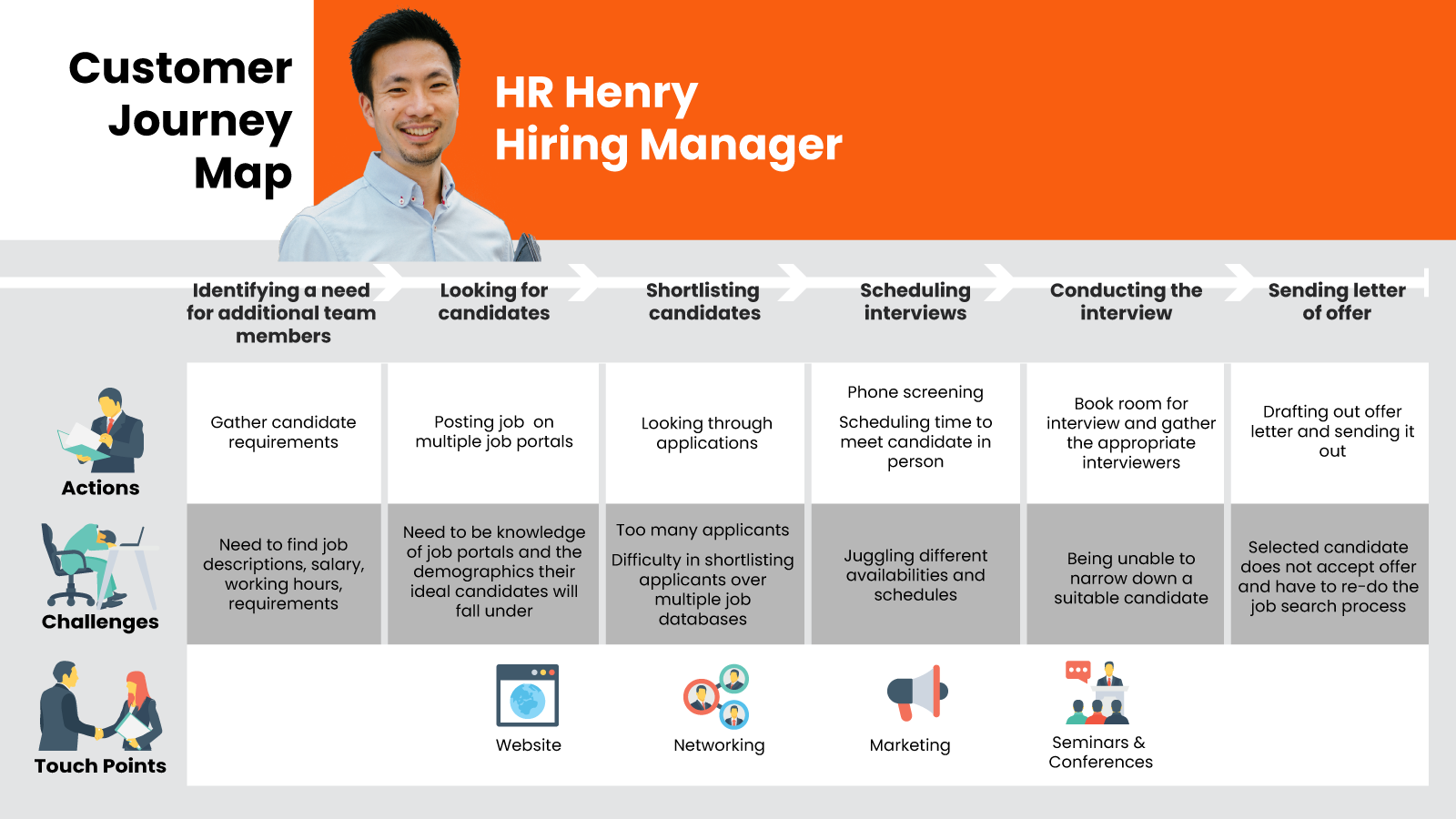
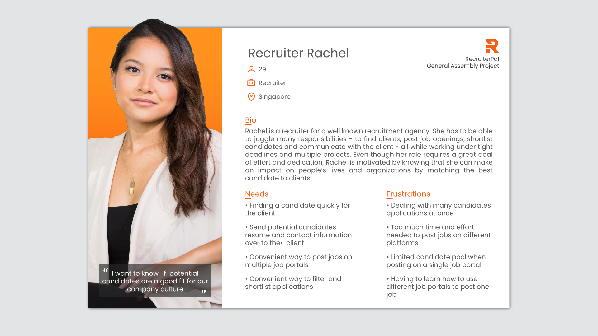
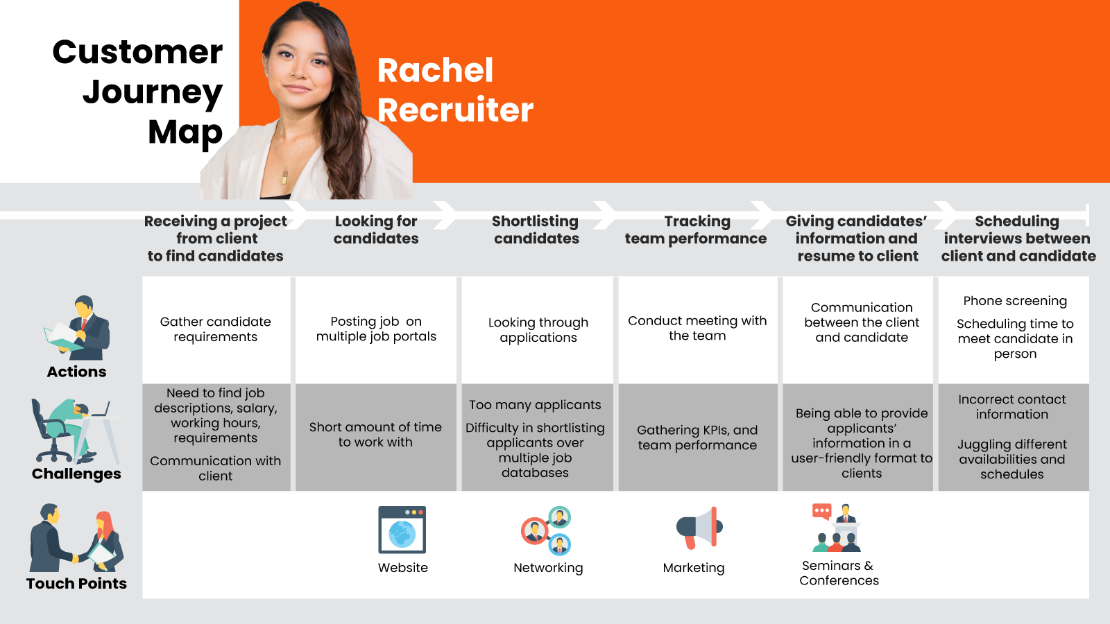
PERSONA & CUSTOMER JOURNEY MAP
From our interviews and user research & affinity mapping, the team created 2 personas (HR Hiring Manager & Recruiter) that are archetypical users who could potentially interact with the RecruiterPal website. Then we created a customer journey map to create a holistic view of visitor experience telling the overall story from our persona’s perspective of over time and across channels.

Make
&
Check

* Design & prototyping was done on Adobe XD & inVision and we got feedback through usability tests by testing our prototype on participants by running through scenarios on how a user would use the website *
Key pages and their iterations are shown below.
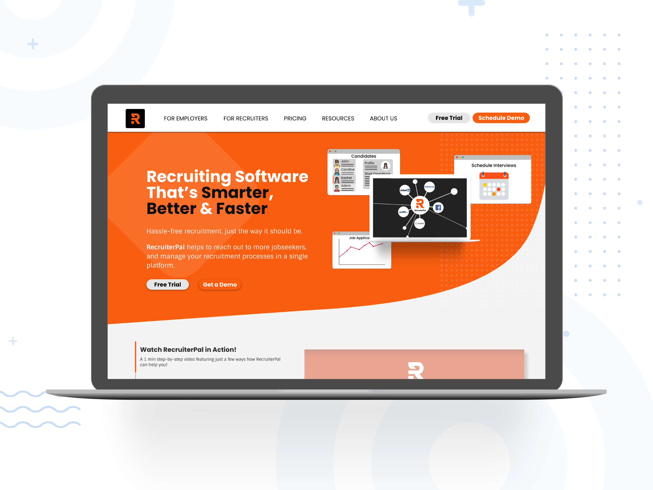
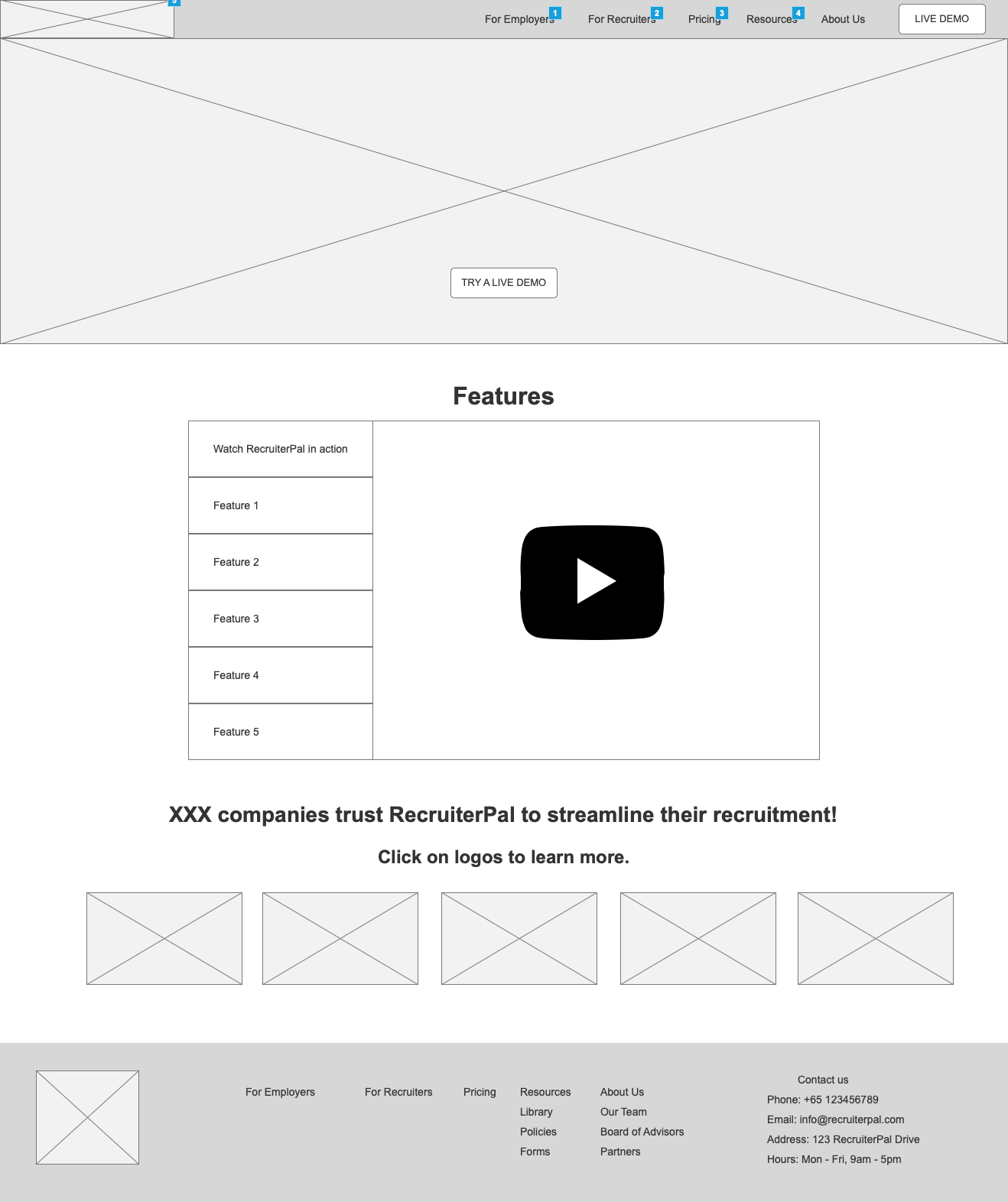
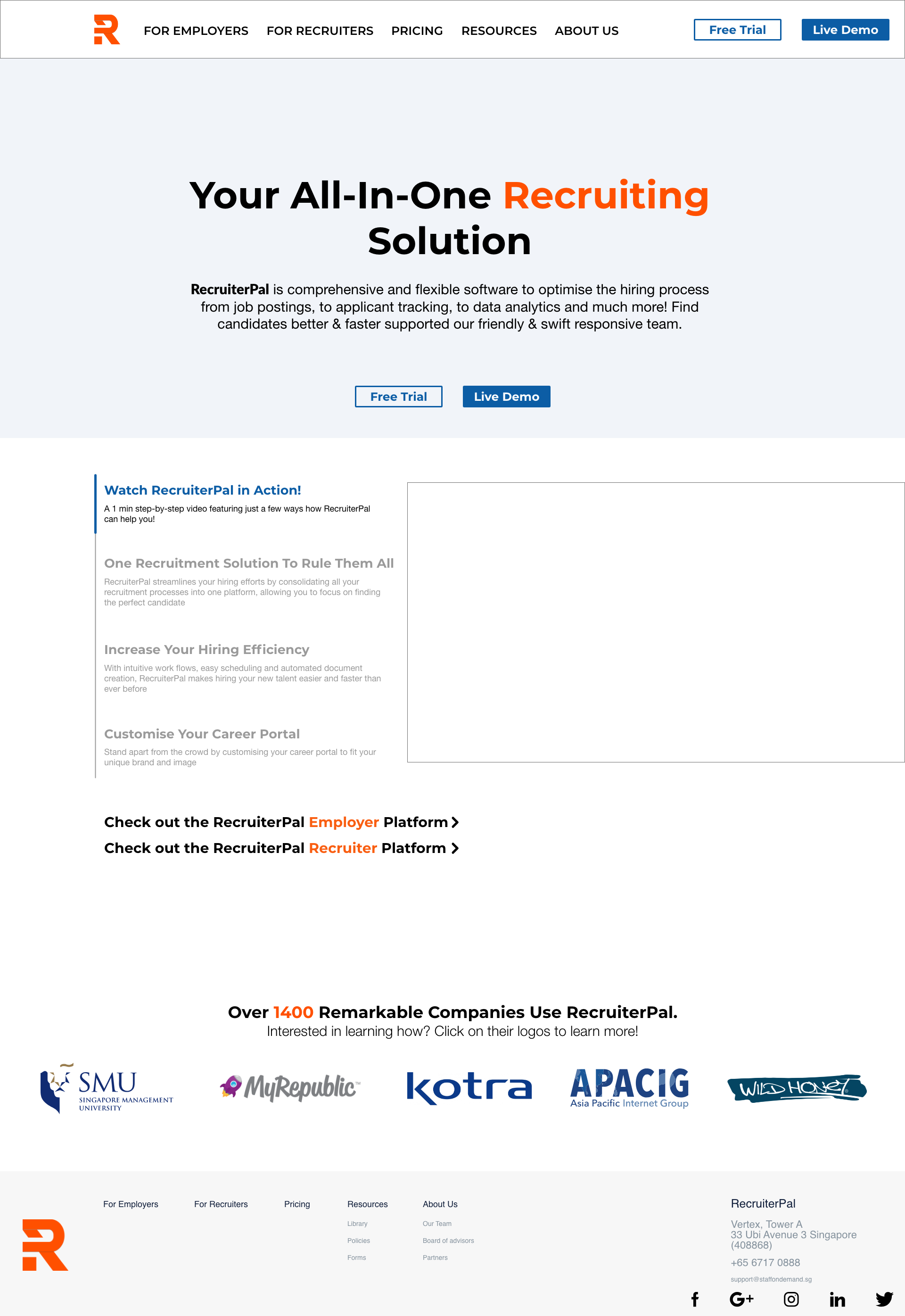
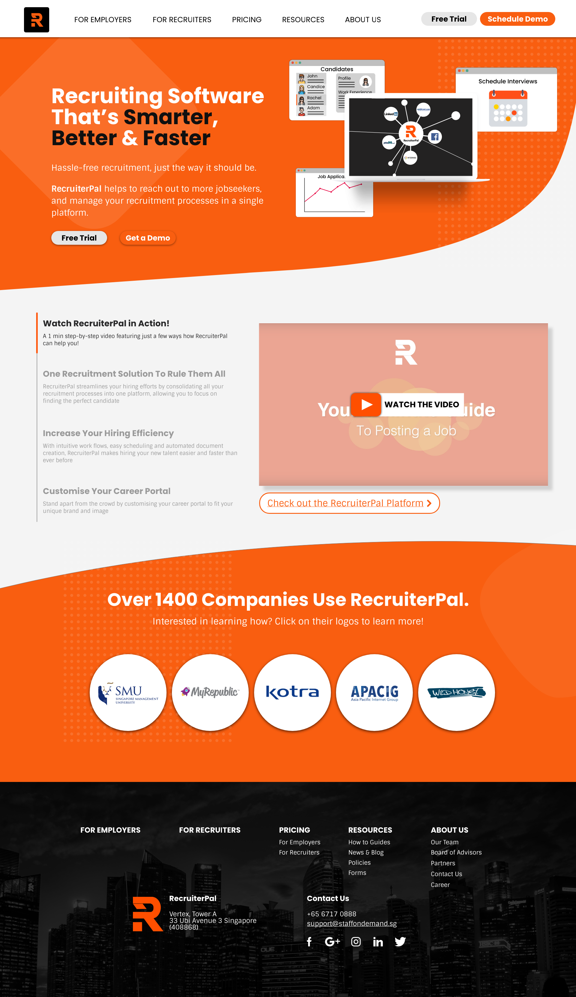
1. HOME PAGE
Major change from original website: we reduced the content in the home page because people did not scroll down past the header page
3 main sections on the main page keeping it minimal, direct and concise:
• Header,
• Features of the software, and
• Companies that RecruiterPal has serviced.
Through iterations we adjusted the copy of the header to clearly communicate what RecruiterPal does as the message was confusing to the users in the initial iterations. Brought the video as the foucs of the homepage as users found the video as most useful
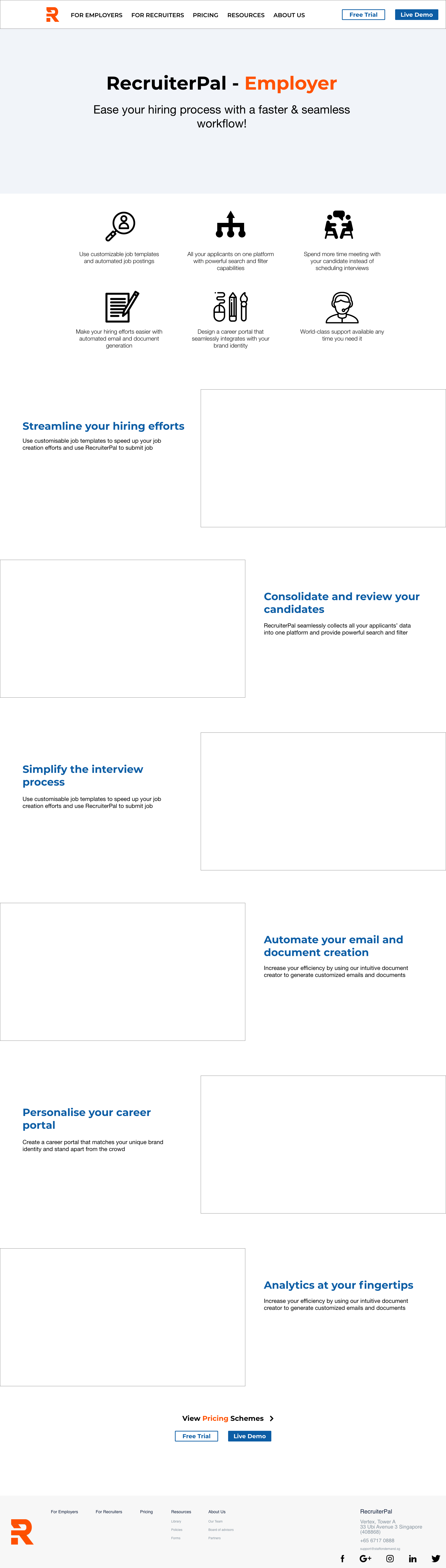
2. PRODUCT PAGE
Major change from original website: we summarized features into 6 icons and made the descriptions short and easy to read, allowing users to quickly scan the page and know what it is. To aid the copy, screenshots were included to illustrate what the software can do.
Using copy and icons refined thorugh iterations, the team was able to clearly distinct the HR Employer software & Recruiter software

3. PRICING PAGE
Major change from original website: Detailed features were organised in a comparison table for users to clearly compare. Reorganised the pricing tiers and their names as users had issues with the way it was originally. Changed “Startup”, “SME” and “Enterprise” to “Basic”, “Professional” and “Custom”. This allowed users to pick and choose a plan without any preconceived idea of the distinction of the company type.
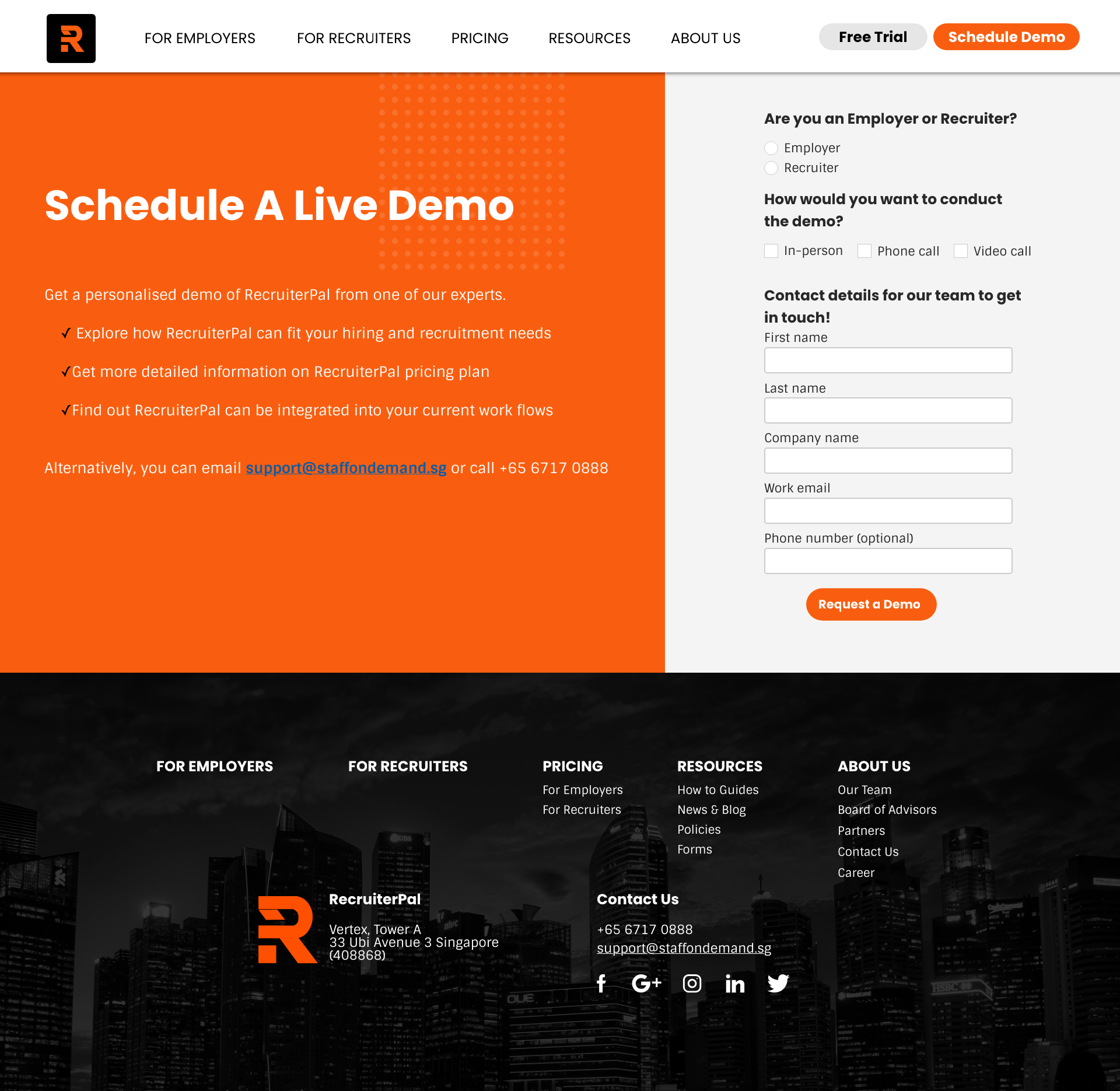
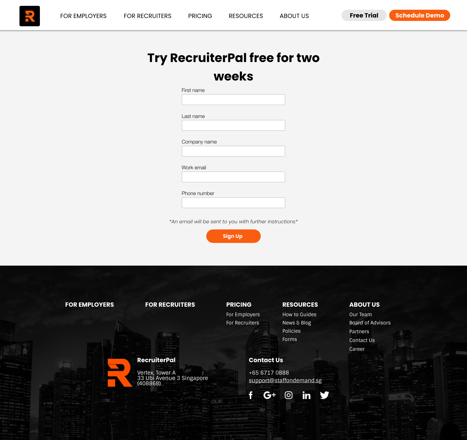
4. Demo and Free Trial
On the original website there was only an option to schedule a demo, but through our interviews and usability tests, around half of our user’s feedback that they would be more inclined to test the software on their own first. Our client was open to introducing a free trial and thus we expanded the on-boarding process to include both. The team streamlined the sign-up process from the original website by including only the key form fields in one page.
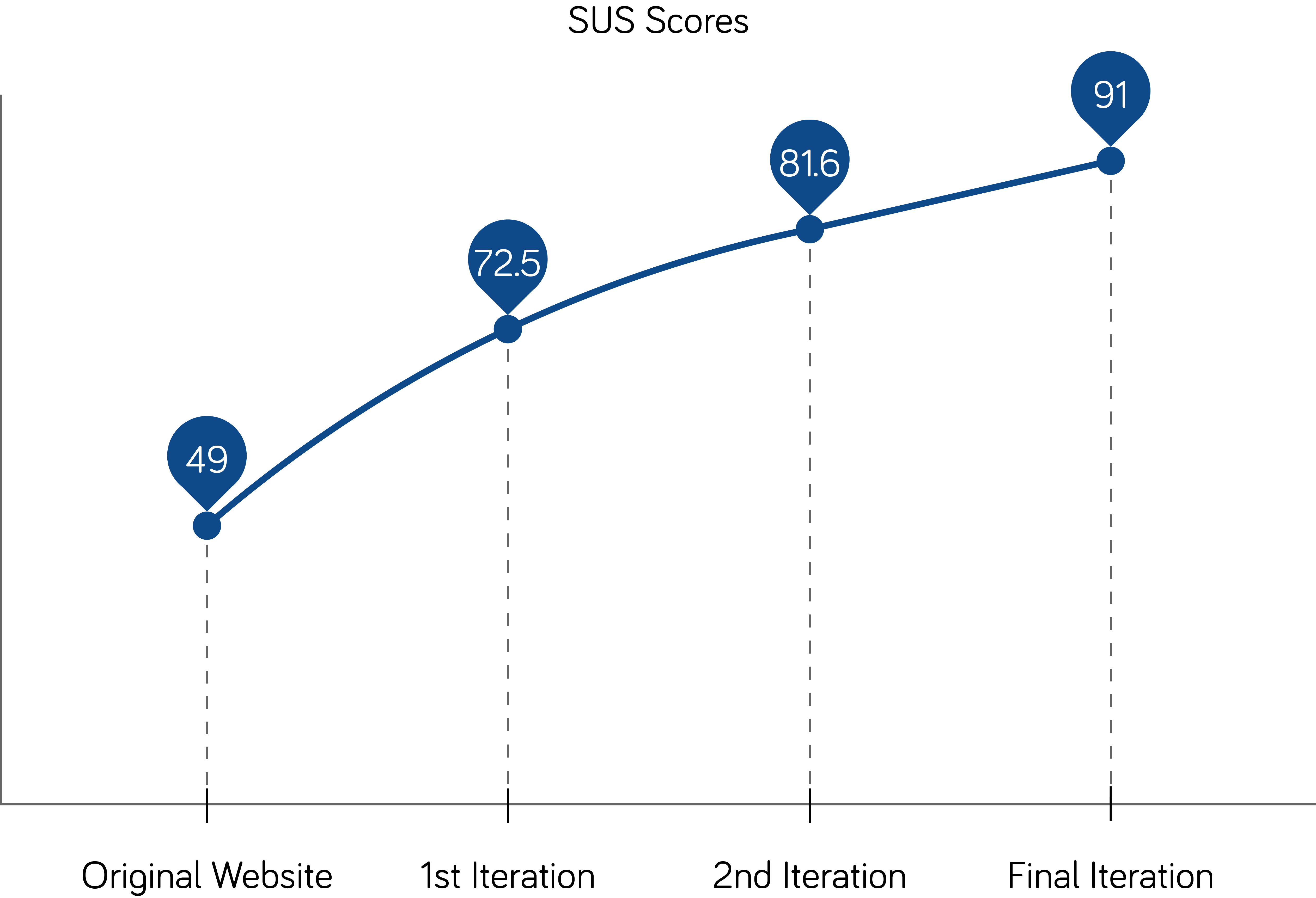
Evaluation
During the usability tests, we also took the System Usability Scale (SUS) scores to measure improvements
Original website: 49
First iteration: 72.5
Second iteration: 81.6
Final iteration: 91