NTU EEE Website Redesign
Overview
Time
Methodologies
My team and I were tasked to redesign the Nanyang Technological University (NTU) School of Electrical and Electronic Engineering (EEE) website. The existing website suffers from buried information and complicated navigation which led to user frustration. By conducting contextual inquiries, the team was able to redesign the site’s information structure and key pages based on users needs. Through usability tests, actual NTU students found our redesign was significantly more efficient and easier to use than the original site.
2 weeks
Tools
Sketch, Adobe XD
Role
UX Researcher
Interface Designer
○ Card Sort
○ Tree Test
○ User interviews
○ Heuristic Analysis
○ Competitive Analysis
○ Information Architecture
○ User Flow
○ Content Audit
○ Affinity Mapping
○ Wireframing
○ Prototyping
○ Usability Testing
The Plan
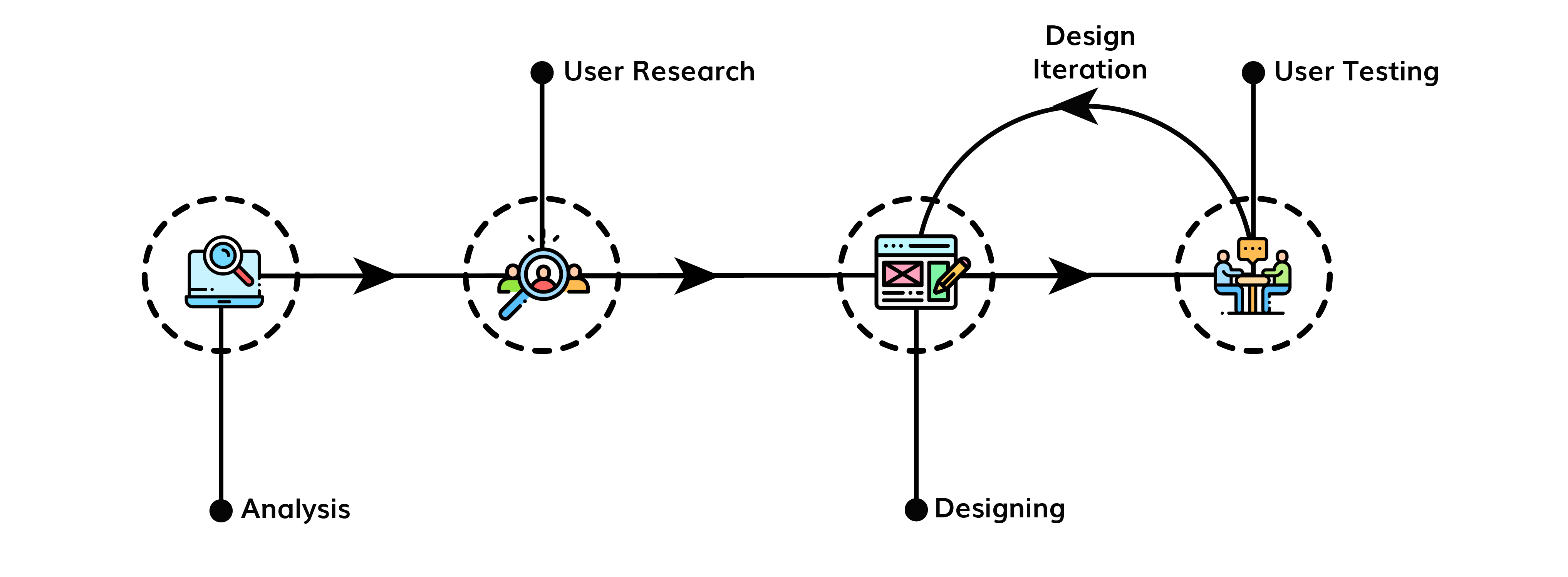

Analysis
HEURISTIC EVALUATION
The first steps to redesign was to research the existing EEE website by conducting a heuristic evaluation using Nielsen’s 10 Usability Heuristics. Following our persona’s user flow we took down insights from each page. The first glaring issue we found was that information was deeply hidden as it took many pages to reach a particular content. Other problems such as design inconsistencies within/between pages and presence of typos were present.
COMPETITIVE ANALYSIS
To compare how NTU fairs with other similar sites, the team conducted a competitive analysis with NUS Electrial Engineering website. The team found that the NTU website’s user flow was exceptionally long and complex, having to get dig through much more to get the same information.
To get to curriculum & module information, the NTU website requires 7 layers while the NUS website requires only 3 layers.
EXISTING NTU EEE WEBSITE
NUS EE WEBSITE
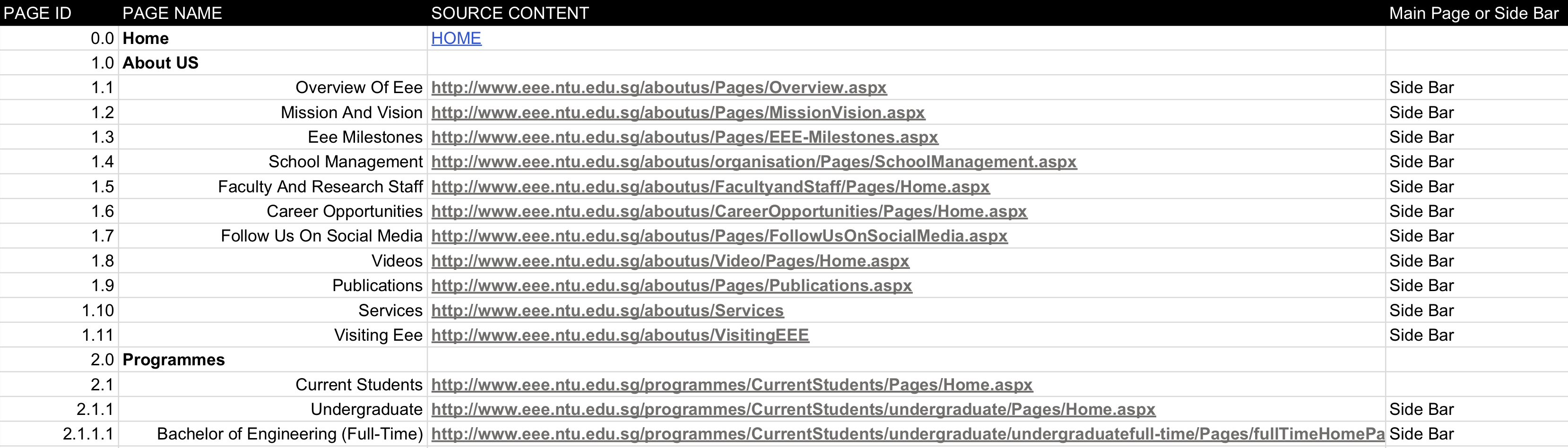
CONTENT AUDIT
Before moving towards user research, the team conducted a content audit to take an inventory of pages and URLs. This gave us a list of content and pages that the team could reorganise, remove, or (if lacking) add content.

User Research
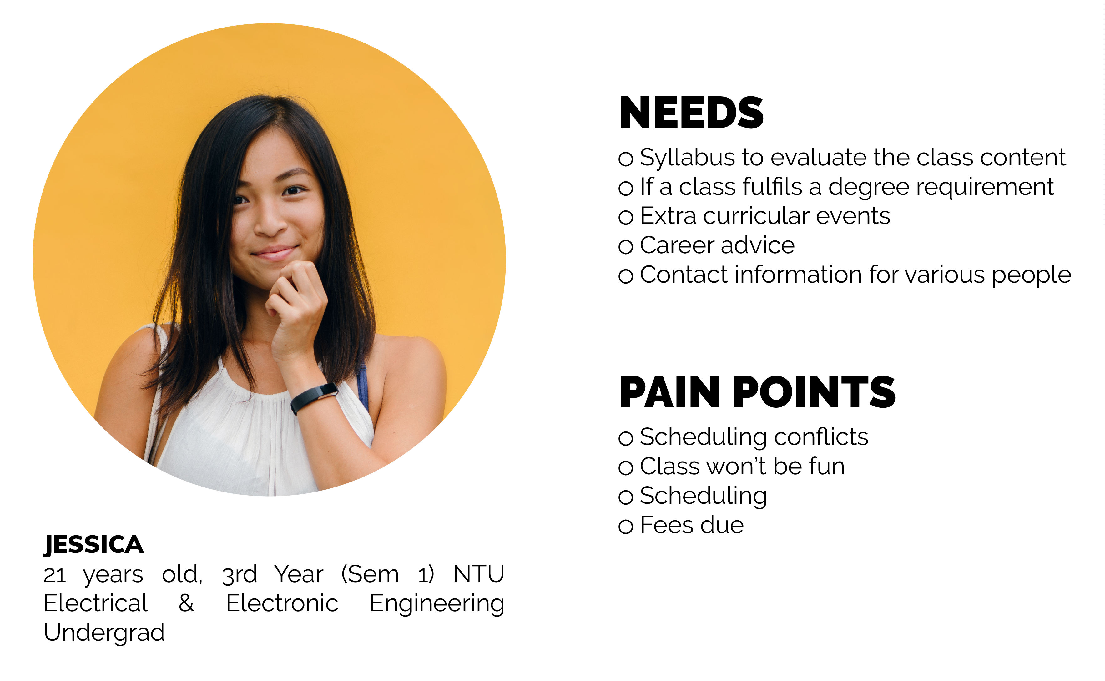
PERSONA
The team decided to focus on a single persona to develop key interactions, flows and pages. This guided us to better understand that particular group of user’s needs. The chosen persona is a Current Year EEE student, Jessica with her needs and pain points shown below.
CARD SORT & TREE SORT
The team first conducted card sort and tree testing on participants that best match our persona to guide us in restructuring the information architecture of the website. Using card sort, the team recruited 16 participants to organise pages into categories that make sense to them. This was to facilitate with our initial high level navigation menu categories and the pages within them.
We found consistencies among the participants having most pages fall under the same categories, but some pages like “EEE Safety” and “career advice” were inconclusive. The team made an initial judgment call and placed the pages according to how many times it fell under a category beset matching the card sort data and created an initial sitemap.
Tree sort was then conducted with 16 participants to validate the new sitemap by testing if participants can get to the correct pages based on our chosen persona Jessica’s needs. Fortunately, a majority of the participants were able to reach the correct destination and we moved on to designing.

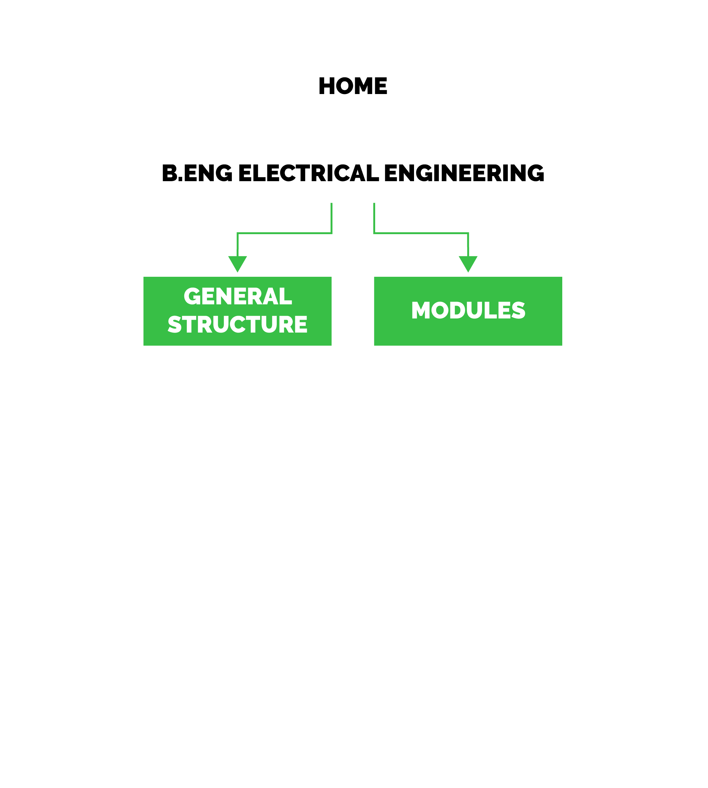
Designing
The team conducted layout, content and aesthetic redesign in an iterative process, validating our redesign with usability tests. The team first started with low fidelity sketching to decide the layout and flow of the website. We sketched the key pages and ran through the user flow of our persona to internally re-validate our current sitemap and ensure that it makes sense.
Following which, we converted the sketches into interactive low fidelity digital wireframes, which could be used for testing. Pages leading from the home page to various key tasks like curriculum information were all designed in grayscale. The lo-fi prototype was done rapidly to quickly gain any feedback with the navigation process early on. Key pages and their iterations will be highlighted here.
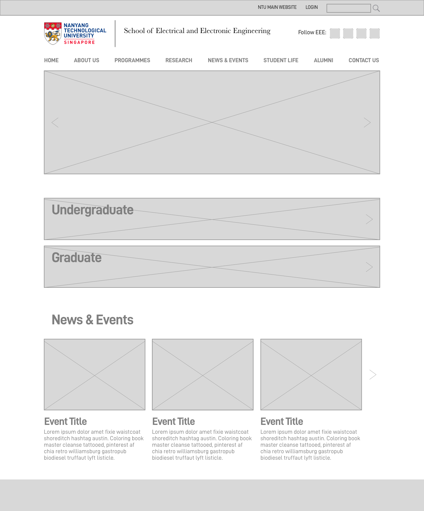
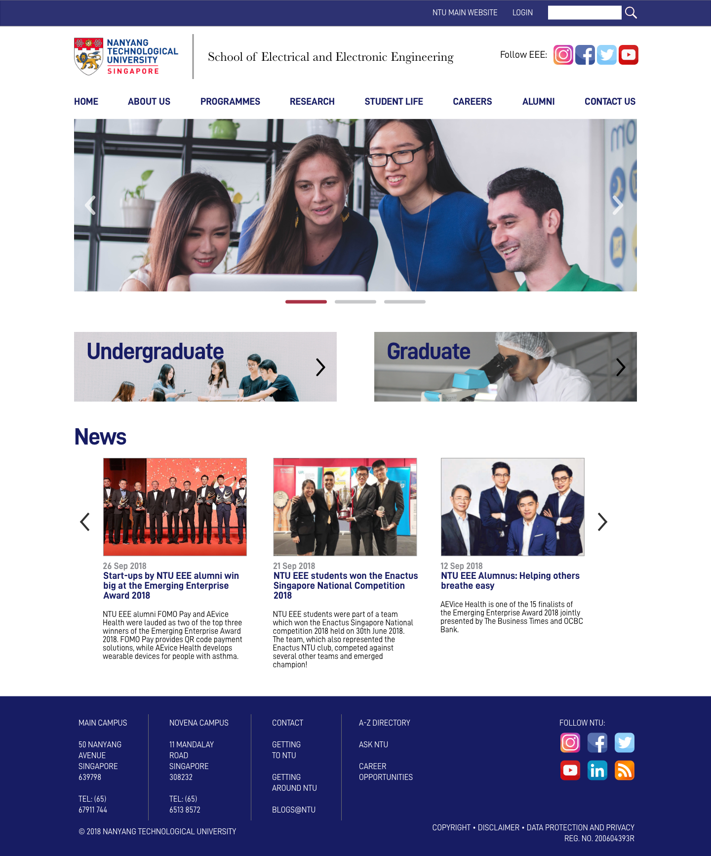
HOME PAGE
Design was kept simple and minimalistic to prevent user information overload and reduce clutter. Navigation bar to main NTU website was reduced to a single link so users don’t get confused and accidentally exit the EEE website. Important pages are highlighted on the main page and news that EEE wants to promote is also displayed.
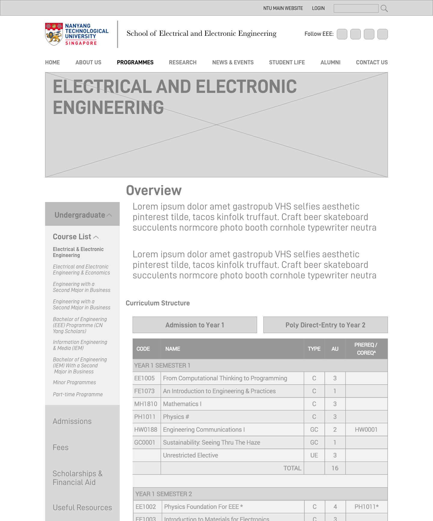
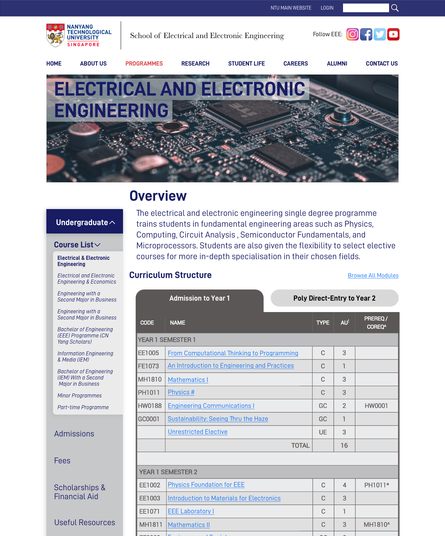
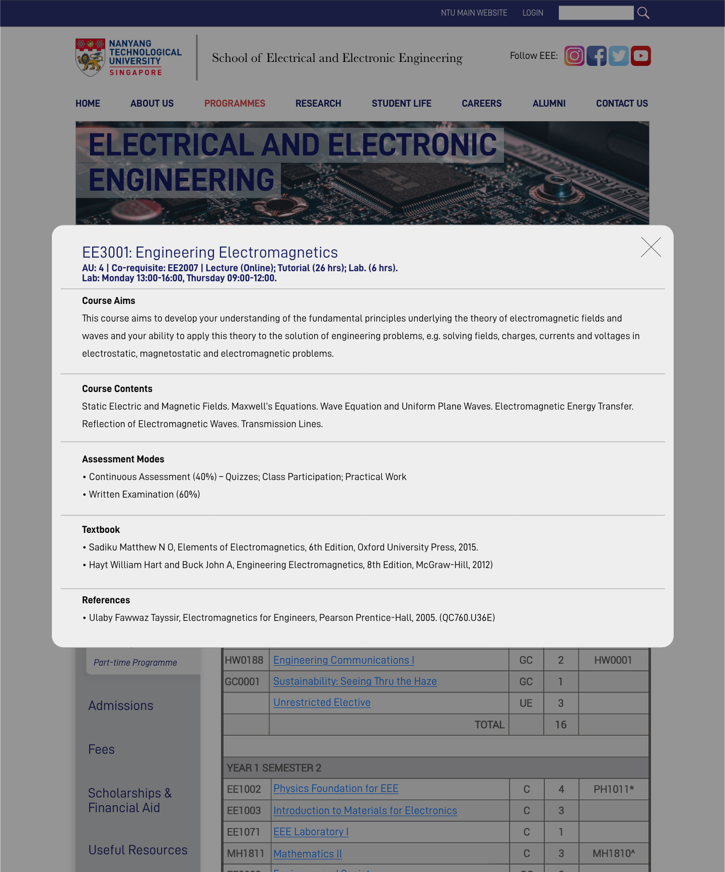
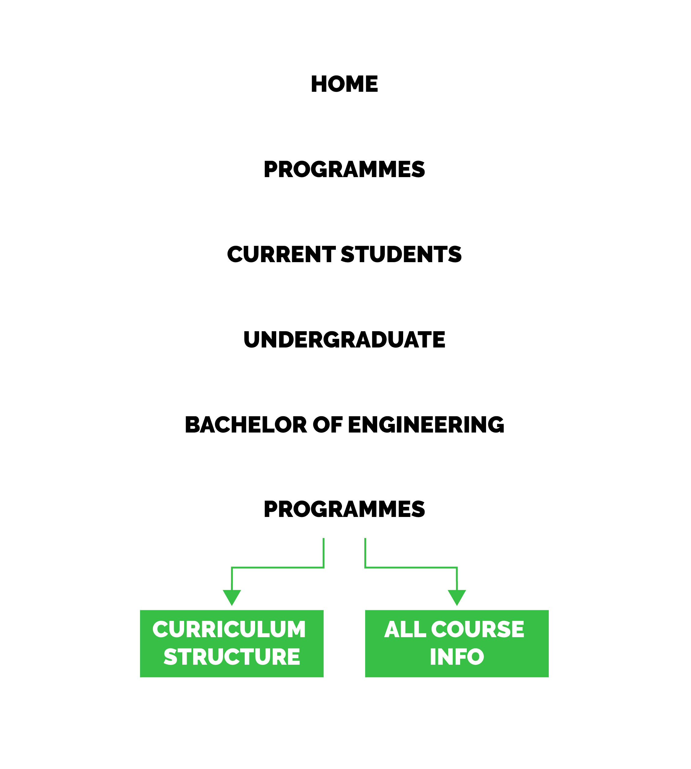
COURSE CURICULUM
Key design considerations for this page was to keep this page it lightweight. Micro-interactions in the form of pop-ups were used so the users’ flow is not interrupted. This was taken into consideration the module page is quite long and it would be confusing for users to go back and forth between pages.
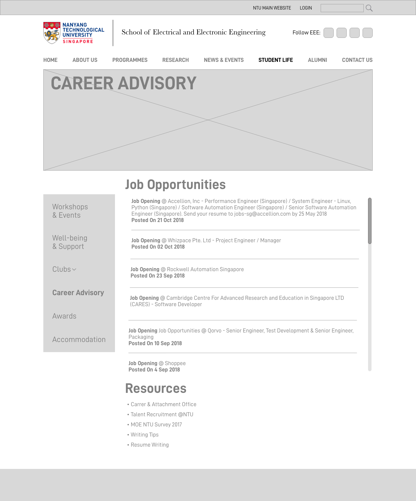
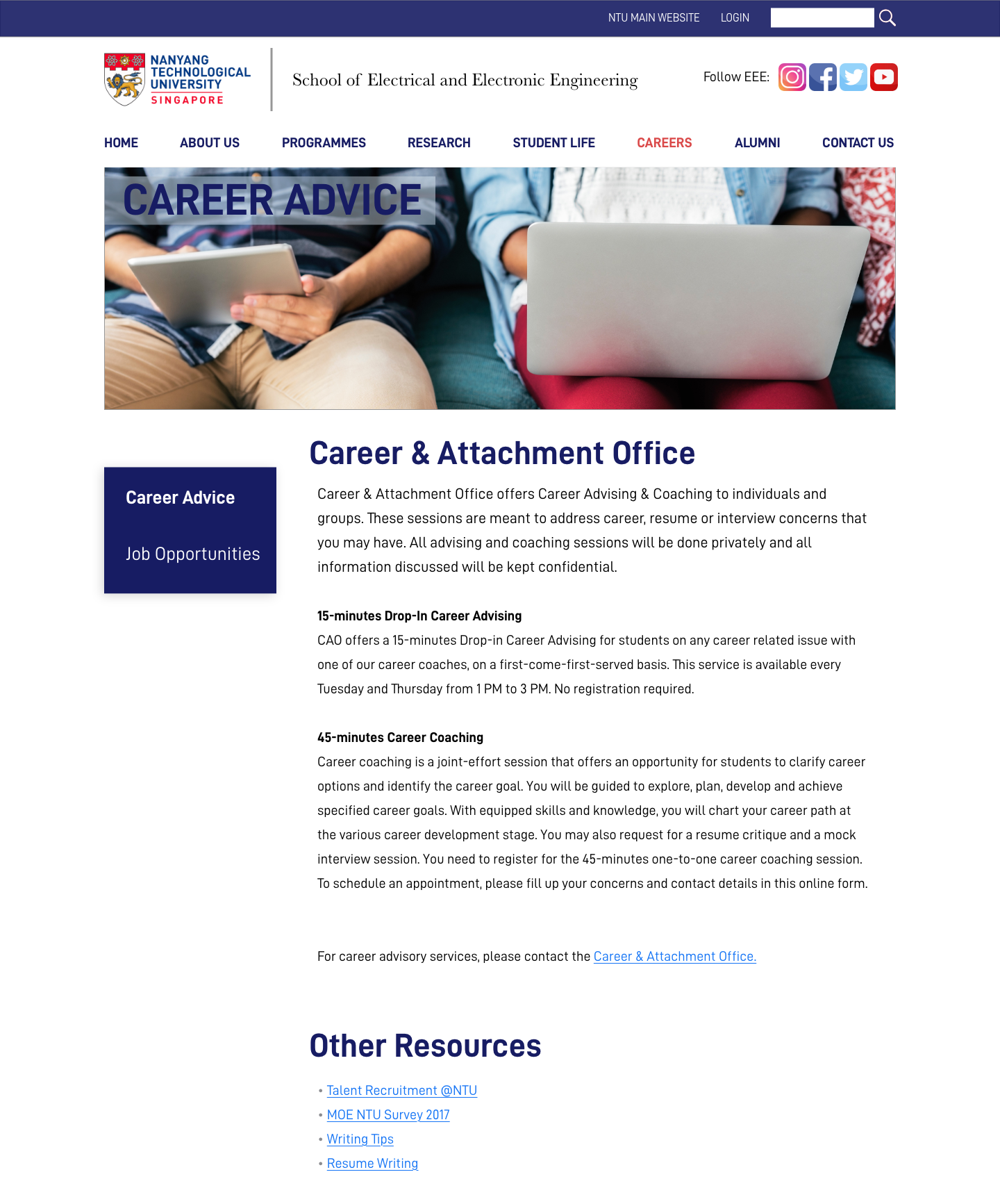
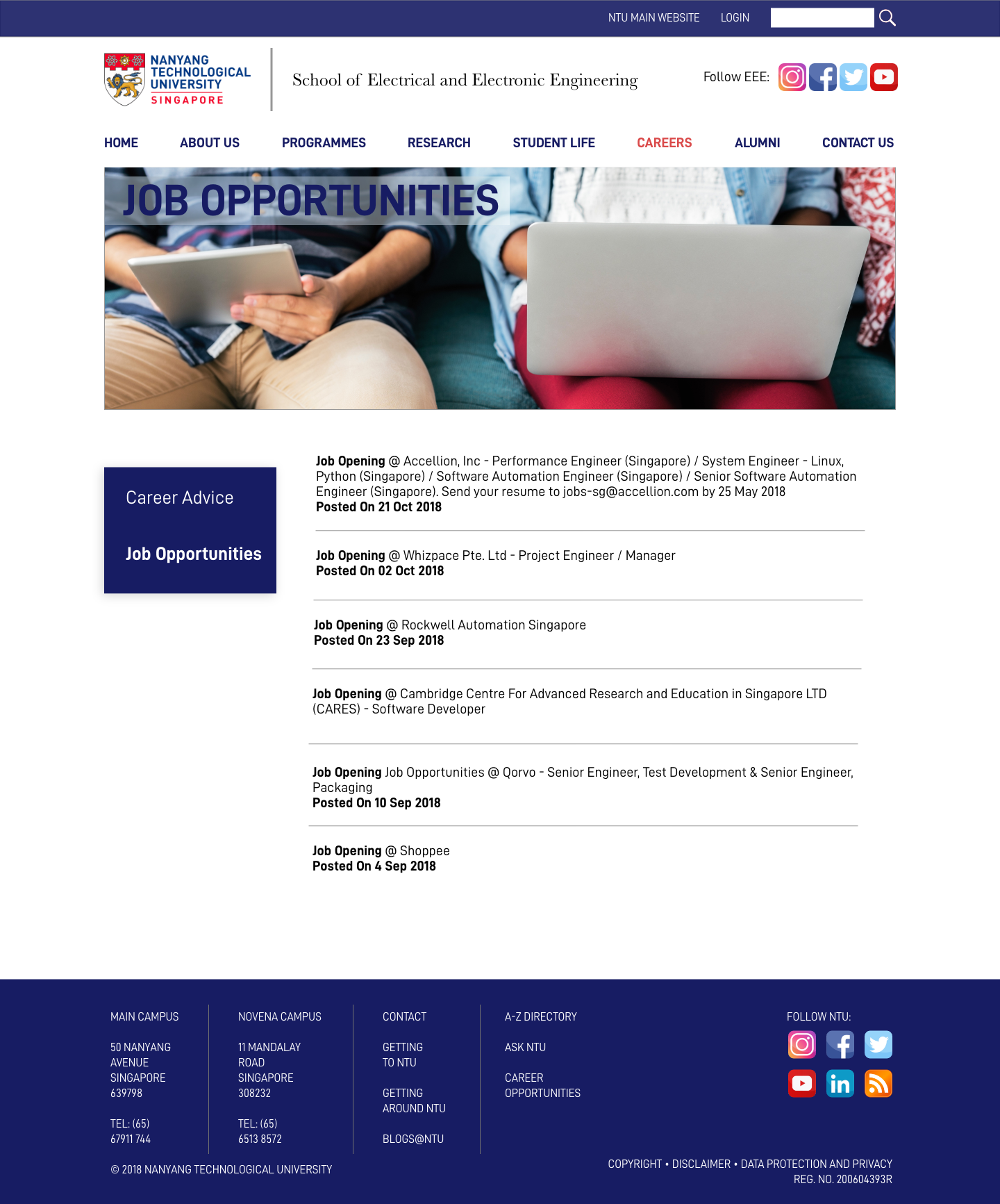
CAREER ADVICE
Career advice is complied from the the main NTU website and the existing EEE website for ease of access. Users will be linked to the Career & Attachment Office website for more detailed information if needed. In the hi-fi prototype, career advice and job opportunities are on different pages to prevent information overload.
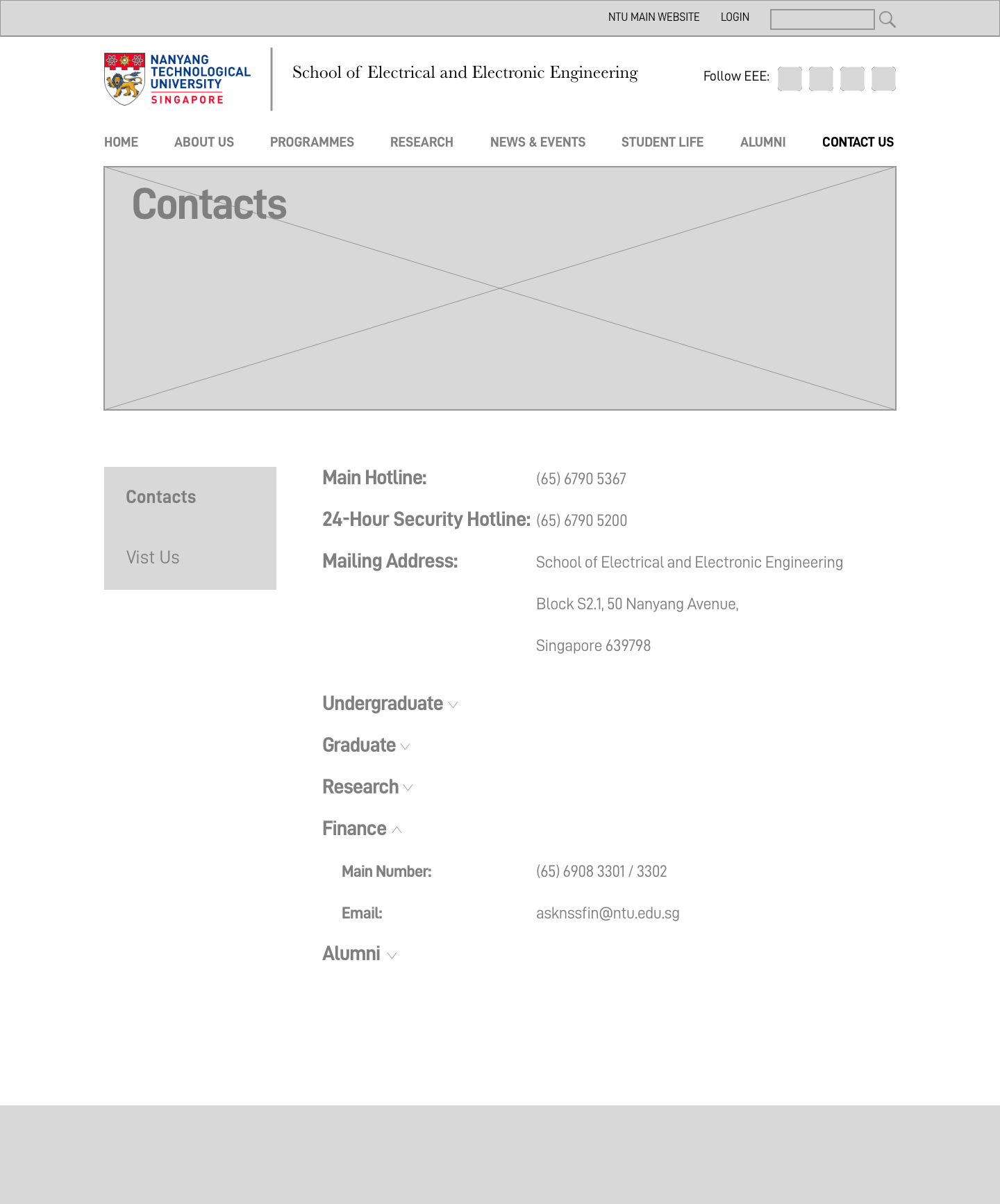
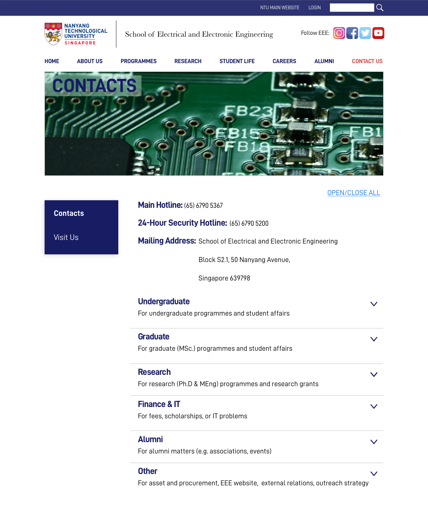
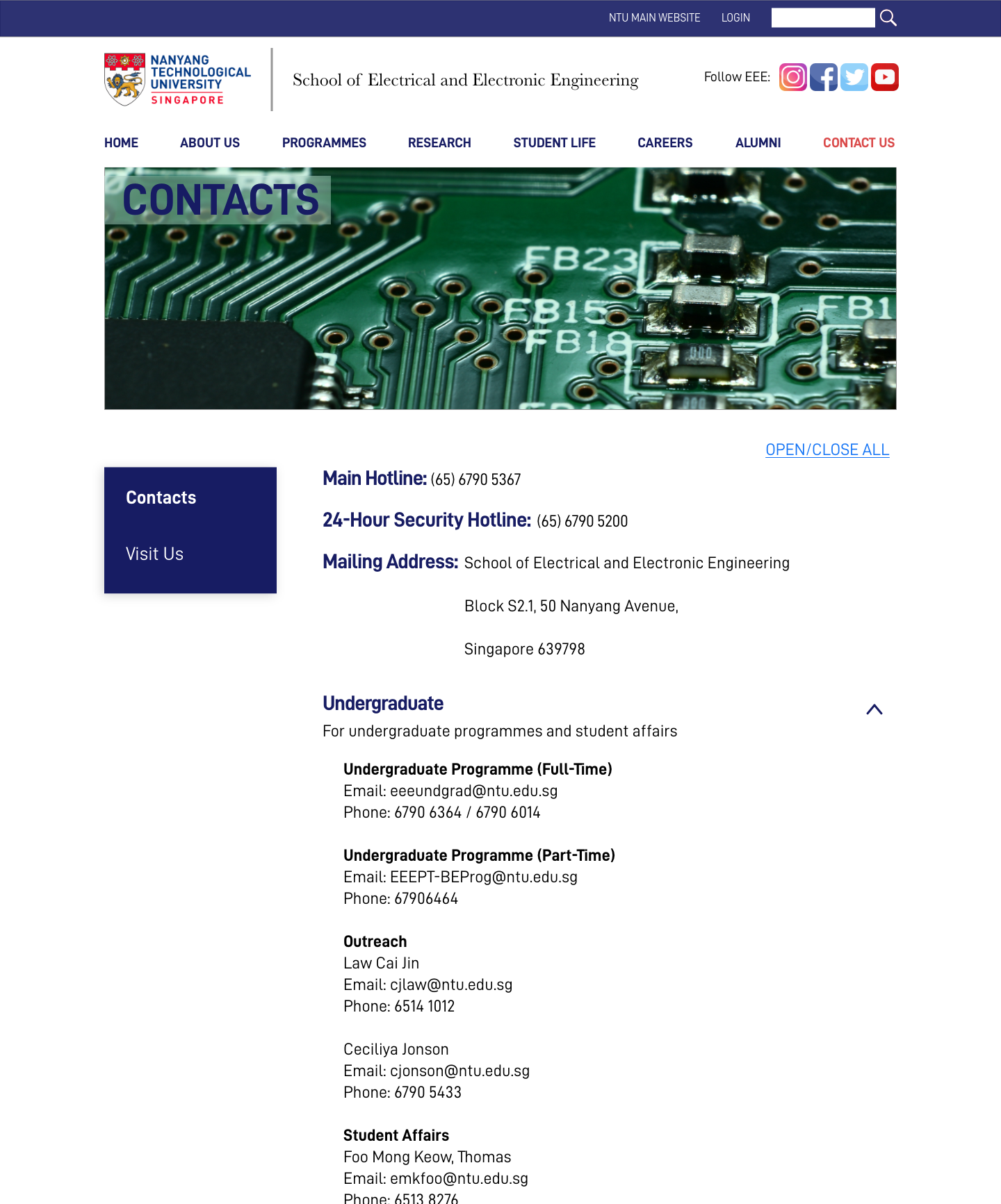
CONTACTS
Contacts were complied and categorised the contact details of EEE, allowing the user to find the correct contact easily. Drop down panes were utilised to prevent information overload.
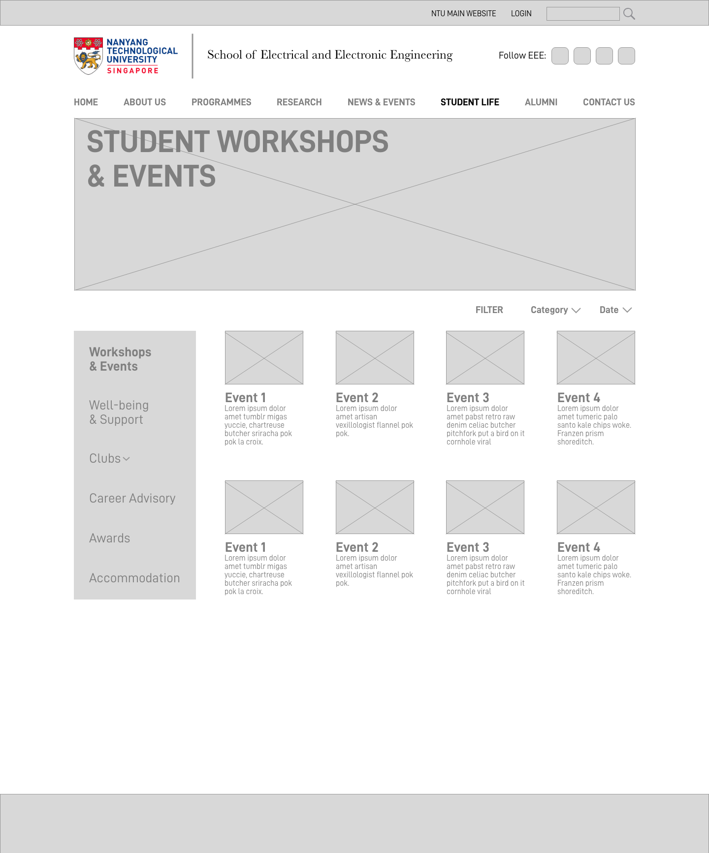
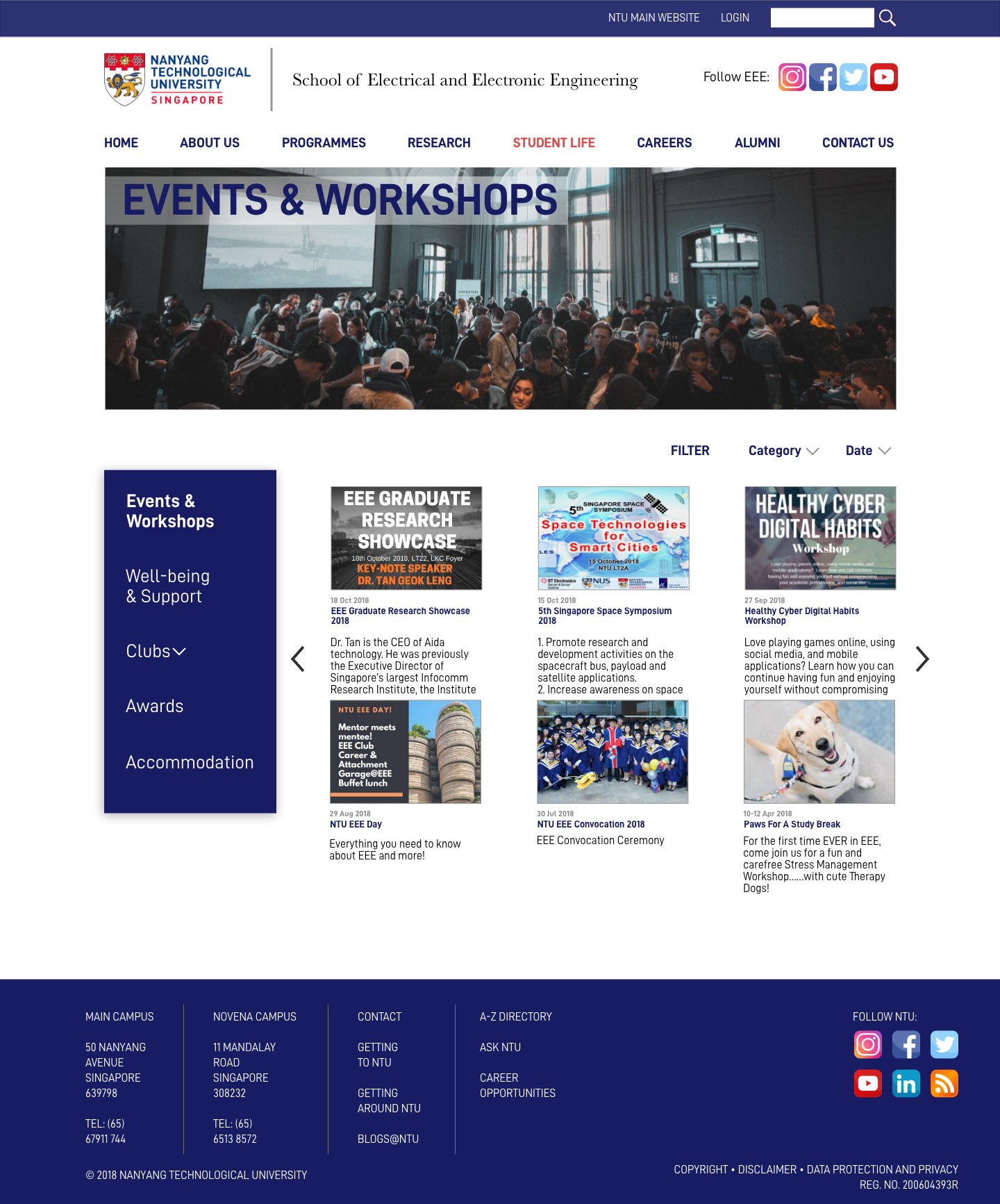
STUDENT EVENTS
The design here was kept simple and minimalistic, keeping it consistent with the homepage

User Testing
With our digital wireframe in hand, the team went to NTU EEE campus and tested our redesign with current NTU students. During the usability evaluation, participants were asked to complete 5 tasks on the redesigned site. The tasks were presented in order and participants were asked to think out loud while going through them.
Usability test feedback & improvements:
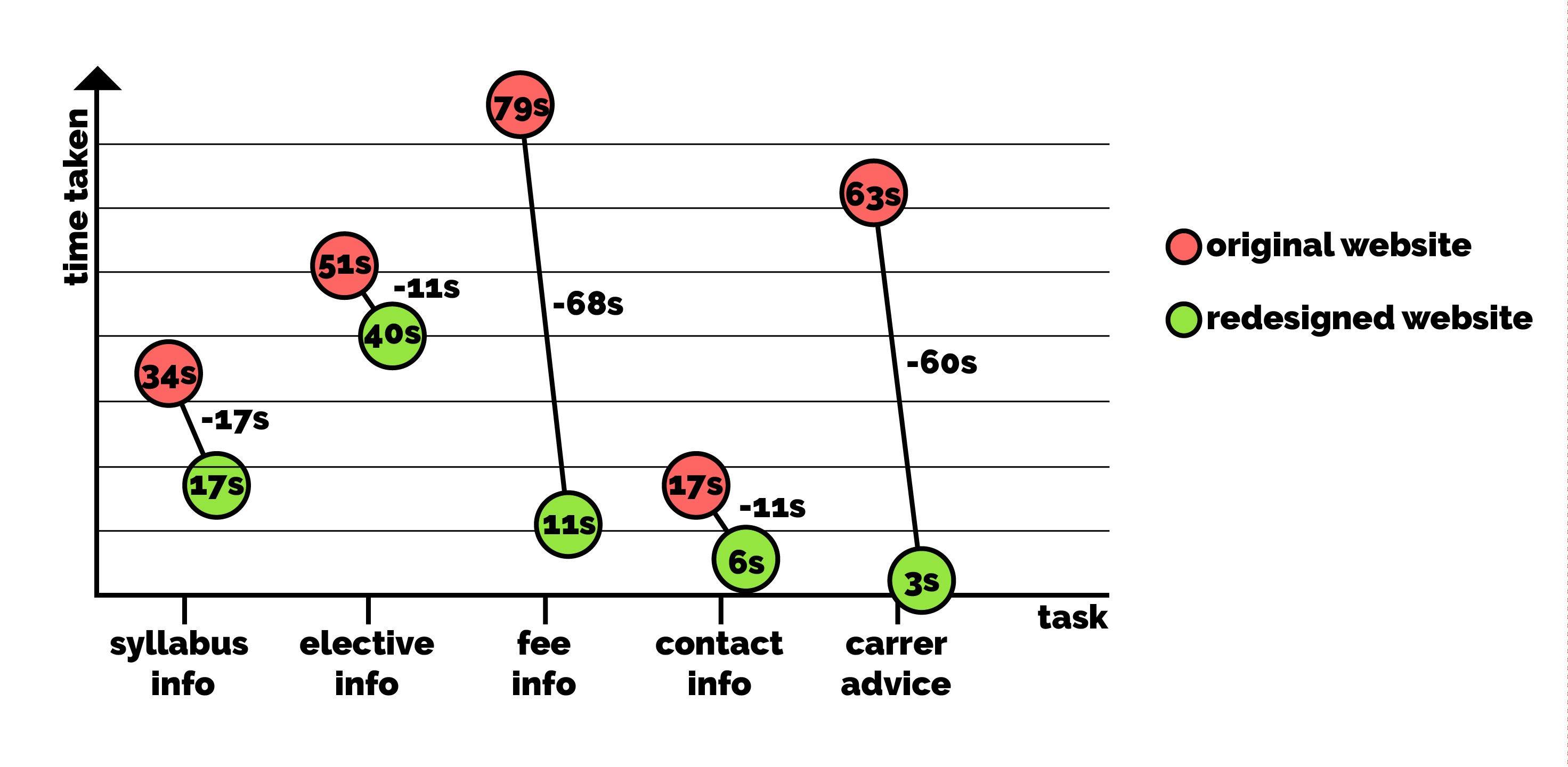
The participants were largely able to complete the team’s prescribed tasks of finding information on course curriculum and elective
Some participants were unable to locate student events within News and Events.
Removed the News and Events category from the main navigation bar to minimise confusion and adding a subcategory Events and Workshops under Student Life. This would enable users to locate both Club- and non-Club events under the same category of Student Life.
- None of the participants were able to complete the task successfully and locate career advice under Programmes. Therefore, we created a new Careers category in the navigation bar
Statistics of redesigned website:
During the usability tests, we also took down and System Usability Scale (SUS) scores and average time taken for tasks to measure improvements.
SUS INITIAL: 48.3
SUS FINAL: 85