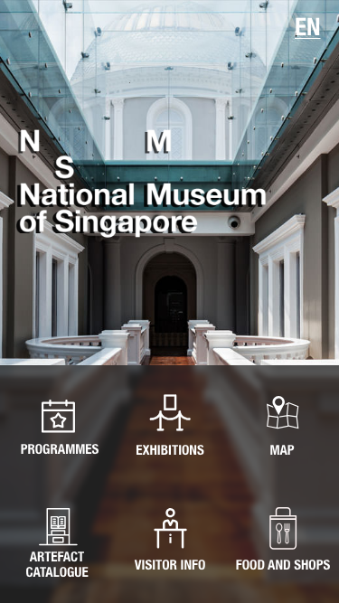
National Museum of Singapore Mobile App Redesign
National Museum of Singapore Mobile App Redesign
Overview
Our team was tasked to redesign and identify problems and/or opportunities with the National Museum of Singapore app and utilise our knowledge to design a solution. The team overhauled the app, restructuring how the content is displayed and the app flow. We also improved the existing static map and introduced a mobile-assisted interactive tour. Through usability tests, users had a drastically improved experience compared to the original app.
Time
2 weeks
Tools
Adobe XD
Role
UX Researcher
Interface Desginer
Methodologies
- Personas
- Customer Journey Mapping
- User interviews
- Contextual Inquiry
- Heuristic Analysis
- Competitive Analysis
- Information Architecture(IA),
- Sitemaps
- User Flow
- Visual Design
- Content Audit
- Affinity Mapping
- Wireframing
- Prototyping
- Usability Testing
The Plan
The team utilised a framework called “Lean UX” where development is conducted in rapid bursts. It is a cyclic process that pushes the team to design iteratively. The iterative process is guided by user testing after every design change allowing the team to test assumptions rapidly.
*Heuristic Analysis, Competitive Analysis and User & Business Research was mostly done during the first cycle at the beginning of the process*
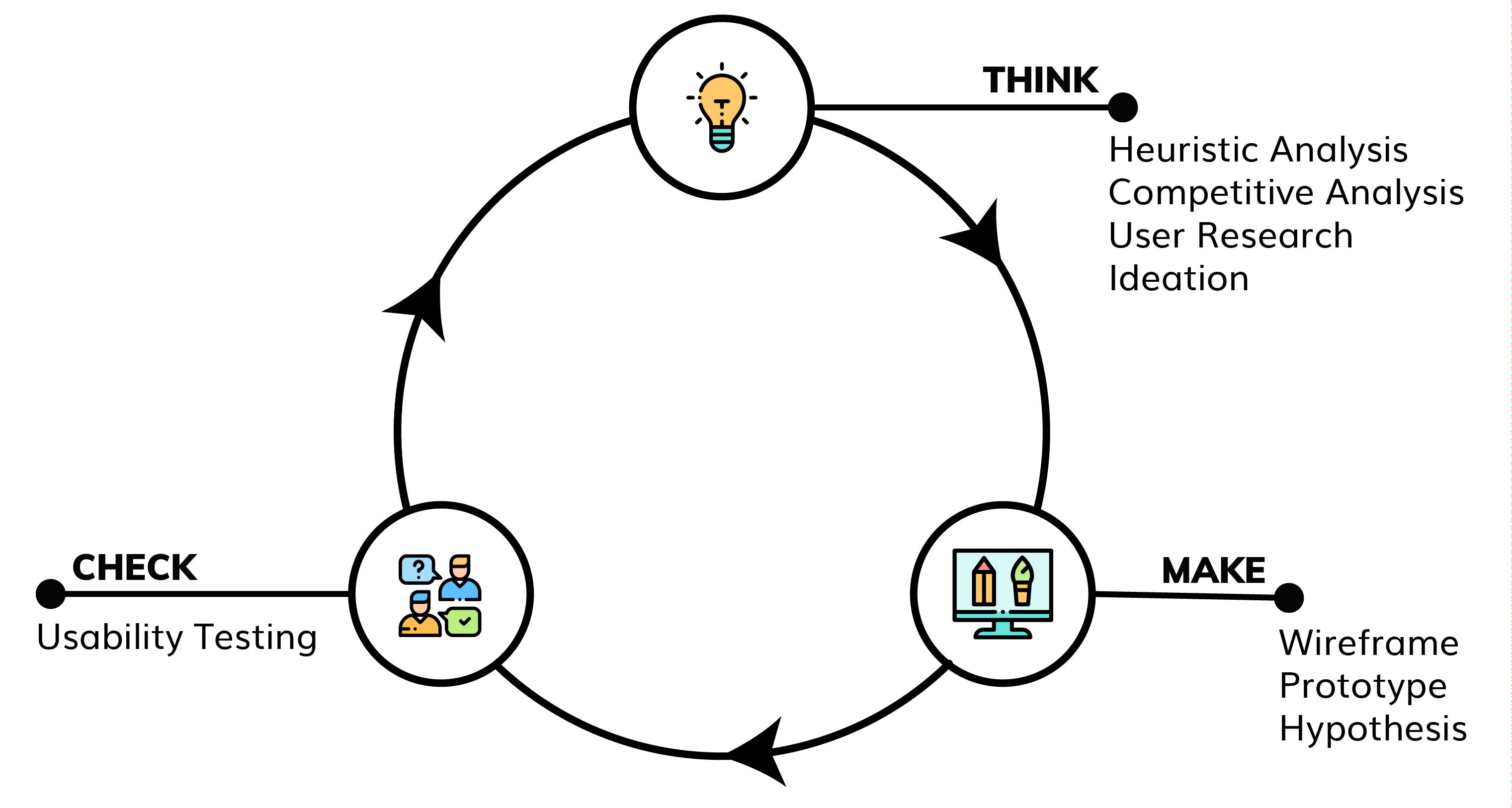

Think
HEURISTIC EVALUATION
Utilising Jakob Nielsen’s 10 Usability Heuristics for User Interface Design, the team began analysing the app.
Here is a summary of the issues found:
- The app generally had issues with flexibility and efficiency of use, consistency and standards
- Errors were present did not allow the user to recover from errors
- Some consistency issues were present where different types of content have the same type of design, leading to confused users
- Side navigation look a large portion of the screen space
- Artefact pages had limited information and has a lack of imagery
USER INTERVIEWS
To gain insights for our redesign from museum visitors, the team conducted contextual inquiries, user interviews and usability tests at the National Museum of Singapore. During this process, we gathered the participants’ motivations, medium of museum information, likes & dislikes of the museum experience. Participants are also given scenarios and we observed how they use the current app and gathered feedback.
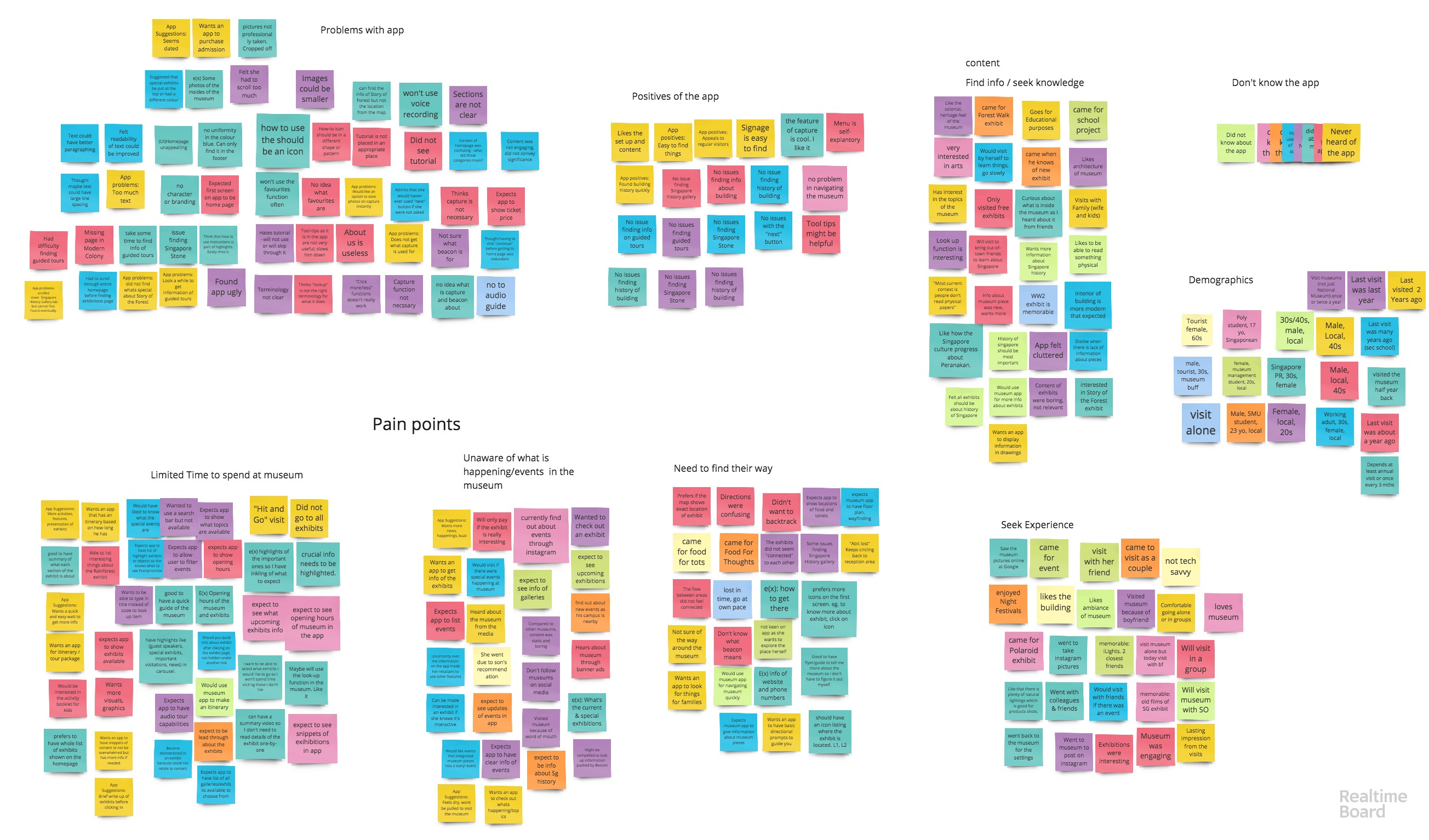
AFFINITY MAPPING
To aid us with analysing the findings, we synthesised our findings using Affinity Mapping. An excerpt of our findings is shown below.
FINDINGS
Initial user research suggested that museum visitors...
○ visit to see special exhibits/topics
○ is unaware of what’s happening at the museum unless there is a big marketing push
○ have difficulty in getting from one point to another
○ have limited time within the museum and has to prioritise what to see
○ has to use a search engine to find out more information of artefacts
Museum visitors expect a museum app to…
○ have clear information about events and exhibits at museum
○ have information about opening hours, ticket prices, directions, contact information
○ avoid information overload
○ to have event and exhibition information readily available to them
Participants using the existing app…
○ found the homepage confusing
○ were confused by the section of museum highlights
○ thought the app looked cluttered and old-fashioned
○ were unsure what the beacon, object-lookup and capture functions were for.
○ disliked the tutorial and would skip through it quickly
○ had a difficult and long time finding information
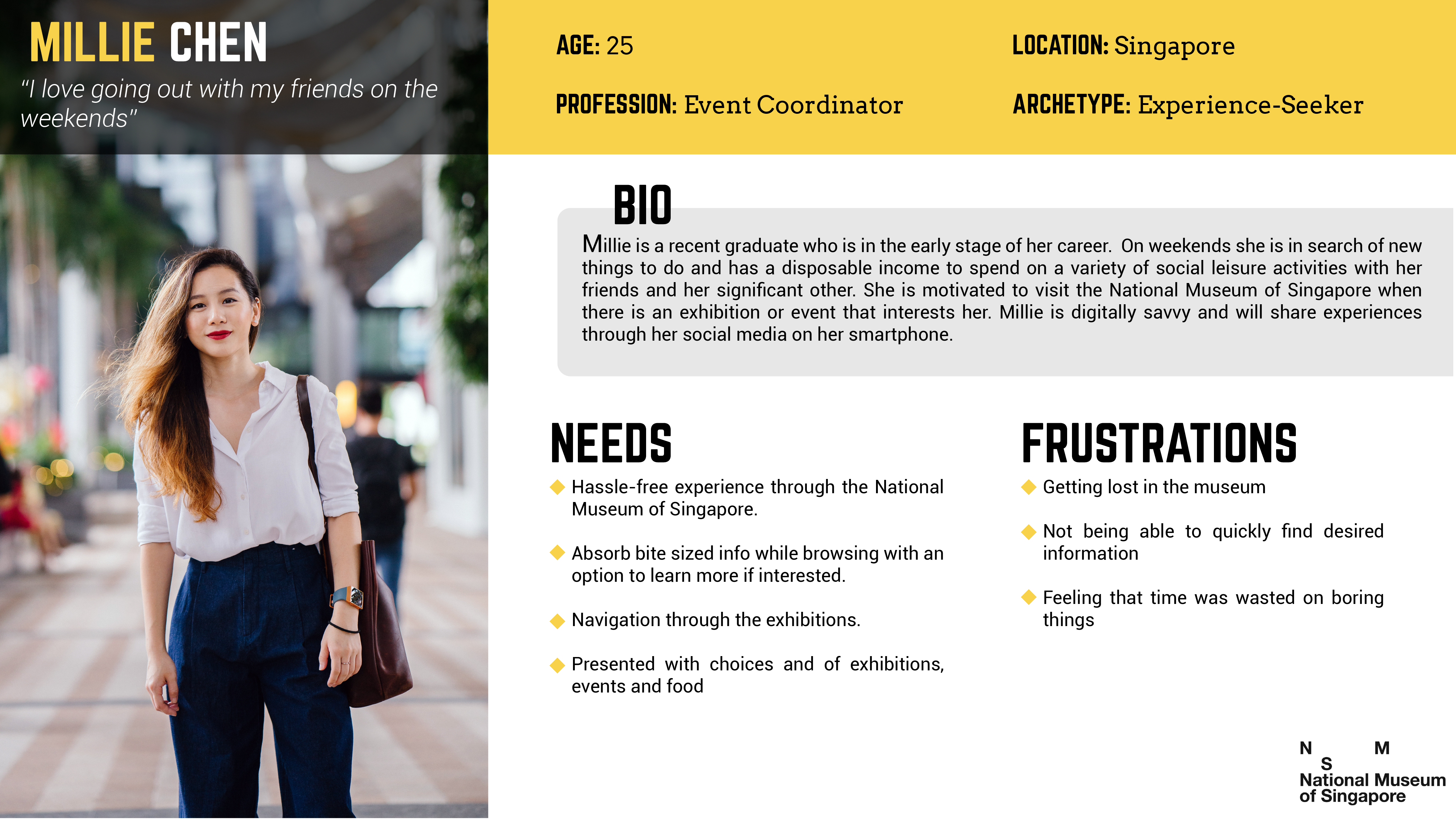
PERSONA
From our interviews and user research & affinity mapping, the team created a persona that is an archetypical user whose goals and characteristics represent the needs of a larger group of users.
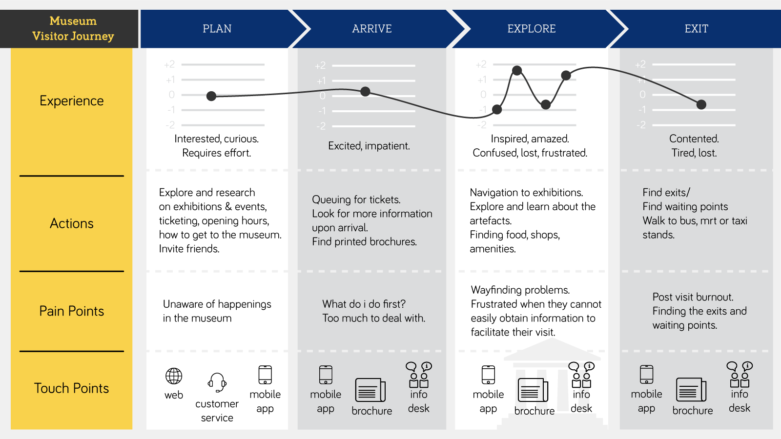
VISITOR JOURNEY MAP
Then we created a visitor journey map to create a holistic view of visitor experience telling the overall story from our persona’s perspective of over time and across channels.
THE PROBLEM(S)


NAVIGATION
NAVIGATION
CONTENT
TIME
Museum goers need a better way to navigate in the museum because they find themselves getting disoriented in the museum.
Museum goers need a better way to navigate in the museum because they find themselves getting disoriented in the museum.
Museum goers need an efficient way to find information about the museum because they get frustrated when they cannot easily obtain information to facilitate their visit.
Museum goers need to be able to quickly decide where to go or what to do at the museum as they have a limited amount of time to spend at the museum.
Museum goers need to be able to quickly decide where to go or what to do at the museum as they have a limited amount of time to spend at the museum.

THE SOLUTION
Re-design the National Museum of Singapore app that will allow users to easily pinpoint their location and points of interests within the museum, easily look up information about the museum, such as and assist with time management.
1st Iteration

MAKE
&
CHECK

* Design & prototyping was done on Adobe XD and we got feedback through usability tests by testing our prototype on participants by running through scenarios on how a user would use the app *
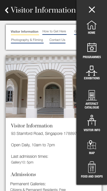
HOME PAGE
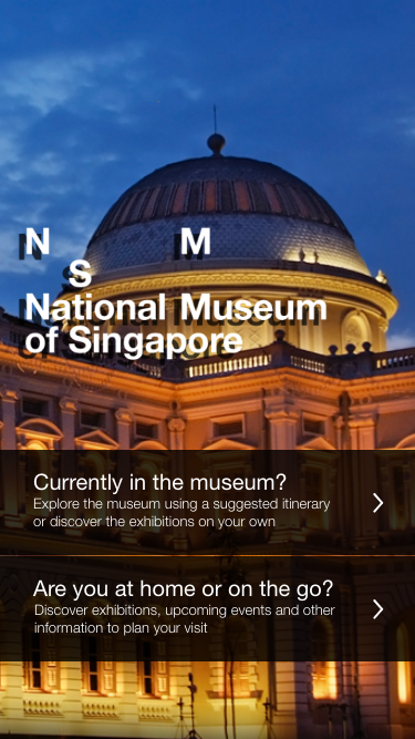
Design Choice
We designed our home screen to separate the features of the app according to whether were inside or outside of the museum.
Findings
Users found that there were overlapping information that one might need within the museum and outside the museum and it became confusing to the users.
Next Steps
Categorise the information in an alternative way that would not be confusing to the users.
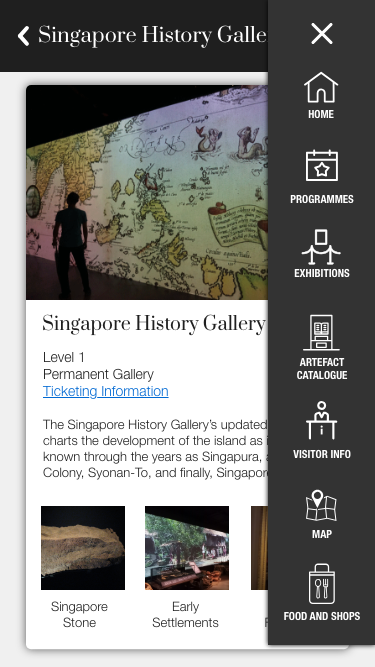
FEATURES PAGE
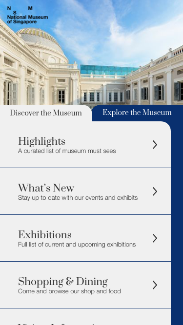
Design Choice
We arranged all the main features and pages as a list without categories as to give the user an overview of everything he/she can expect from the app.
Findings
Information overload was too overwhelming to the user. What the users did like was the little description of the pages the user could click into.
Next Steps
Categorise the information in an alternative way that would not be confusing to the users.
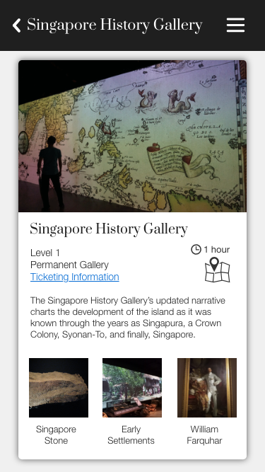
OUR EXHIBITIONS
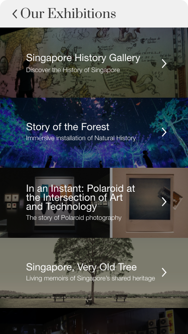
Design Choice
Displayed the different exhibitions as a list overlaid over images.
Findings
Users felt that the text was slightly hard to read but generally liked the visuals of the page.
Next Steps
Increase readability by adjusting how the text is overlaid over the image.
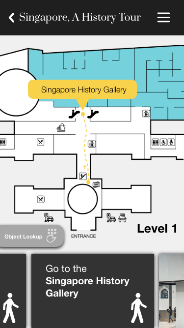
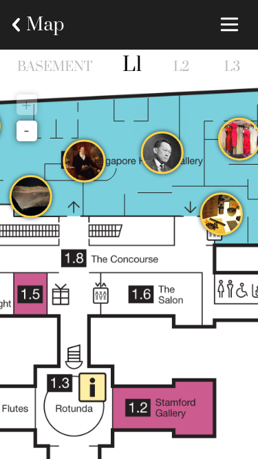
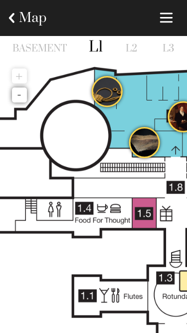
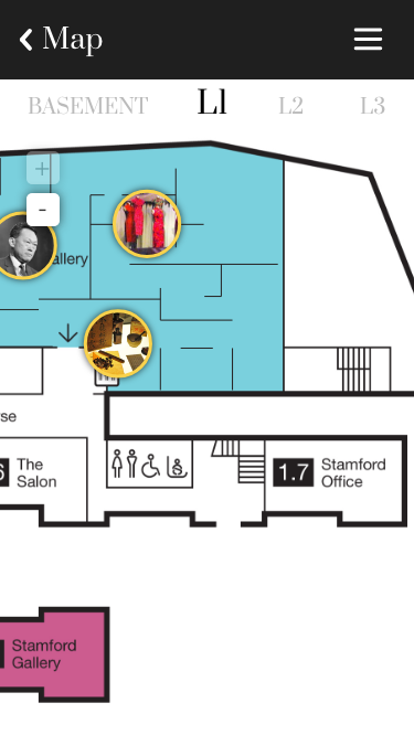
INTERACTIVE TOUR
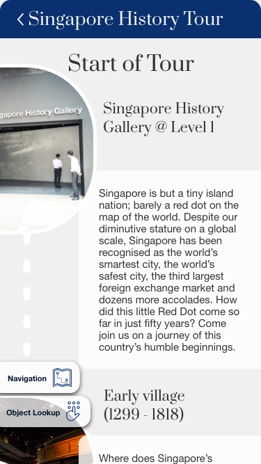
Design Choice
Interactive tour page that allows user to scroll through the page when the user is at a certain location or artefact. Giving an option for the user to click into navigation which they could get to quickly if they were lost.
Findings
Users felt that the design was too unconventional and some had trouble understanding what was happening on the page. Users also commented that they would want navigation to be on the page itself as they felt that this was the more important feature.
Next Steps
Revamp the way the interactive tour works and place a higher importance on navigation.
2nd Iteration
MAKE
&
CHECK
Taking the feedback from our first design we made changes to our prototype.
HOME PAGE
Design Choice
Categorised the pages on the home screen to give the user a clear picture of the various pages.
Findings
Was more well received but there some nomenclature problems. Users could not distinct between happenings and exhibitions. Users had confusion with the word collection.
Next Steps
Change some of the nomenclature.
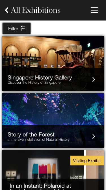
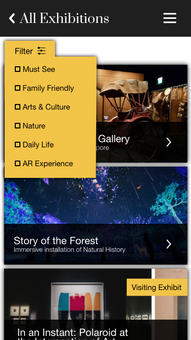
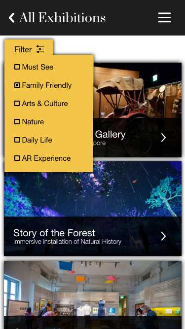
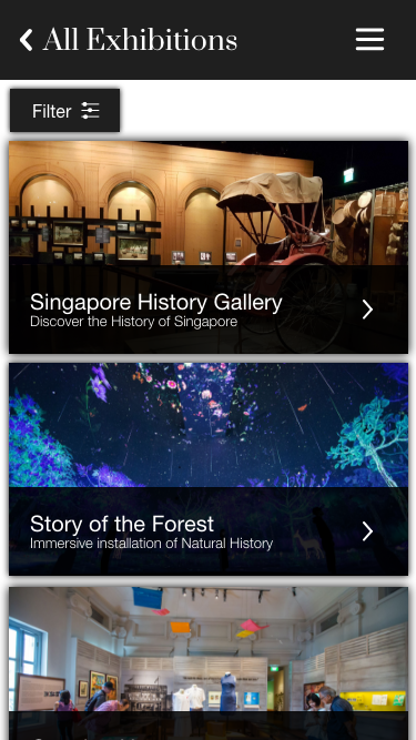
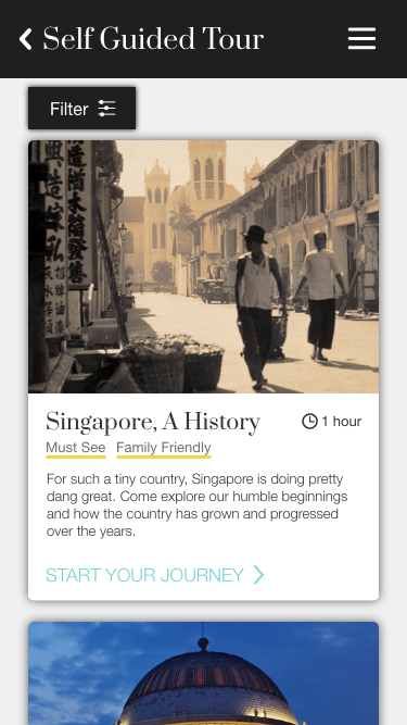
All Exhibitions
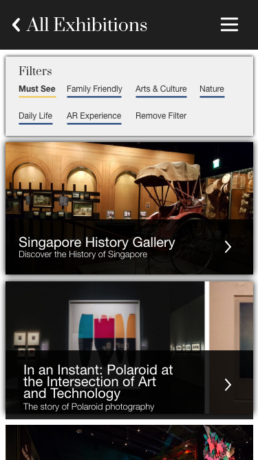
Design Choice
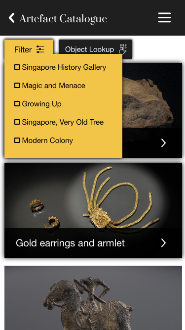
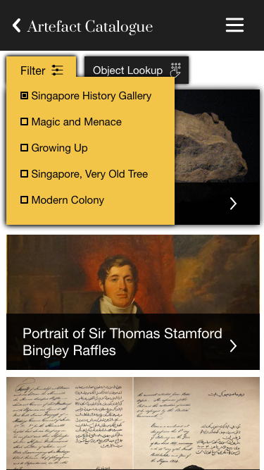
Changed the layout of the text over the image to increase readability. Added filters to allow the user to find their exhibitions based on interest.
Findings
Text was readable. Users felt that the "Filters" card stood out too much.
Next Steps
Change the filters to a drop down menu.
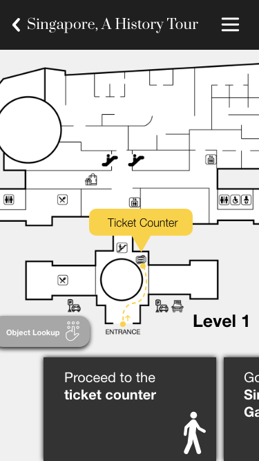
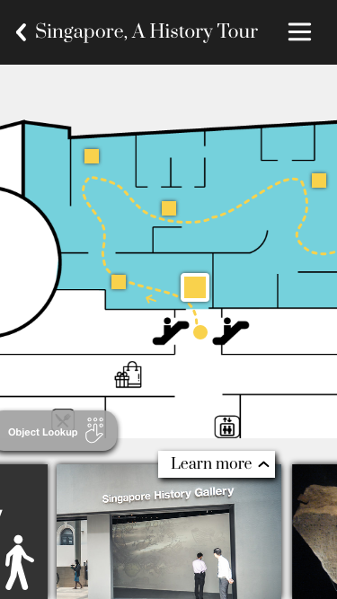
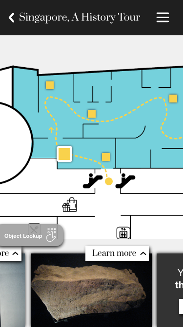
INTERACTIVE TOUR
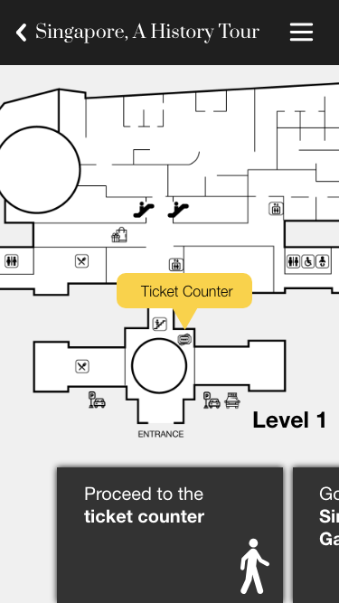
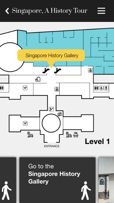
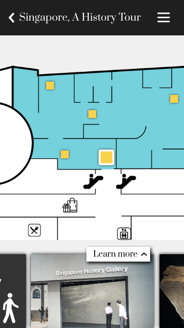
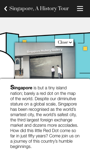

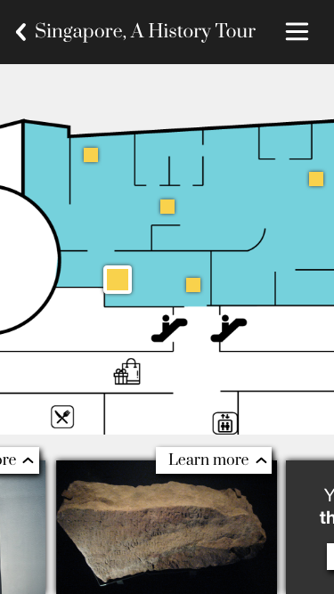
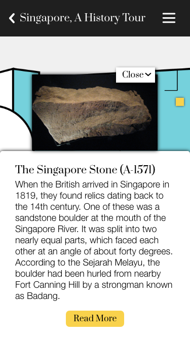

Design Choice
Map as the forefront to help with navigation. Swiping cards to move from points of interest. Prompts for more information at artefacts.
Findings
Was well received and users found this feature to be useful. Need more work on navigation as users might be confused to where to go next.
Next Steps
Add some visual cues for navigation.
Final Design
MAKE
Taking the feedback from our second design we made final changes to our prototype.
EXHIBITIONS PAGE


INTERACTIVE TOUR
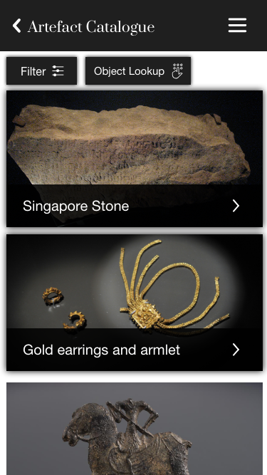
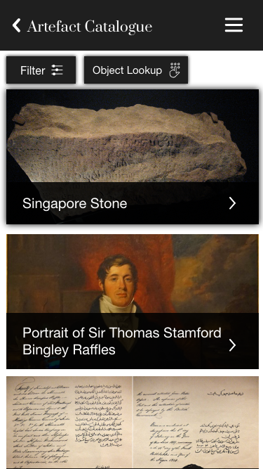
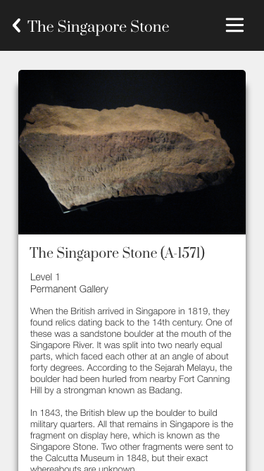
ARTEFACTS PAGE

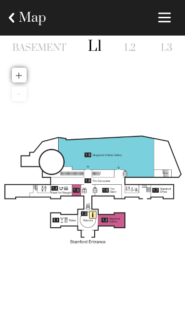

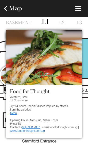
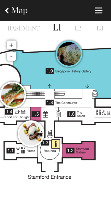

INTERACTIVE MAP
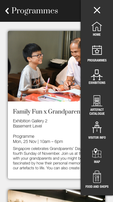
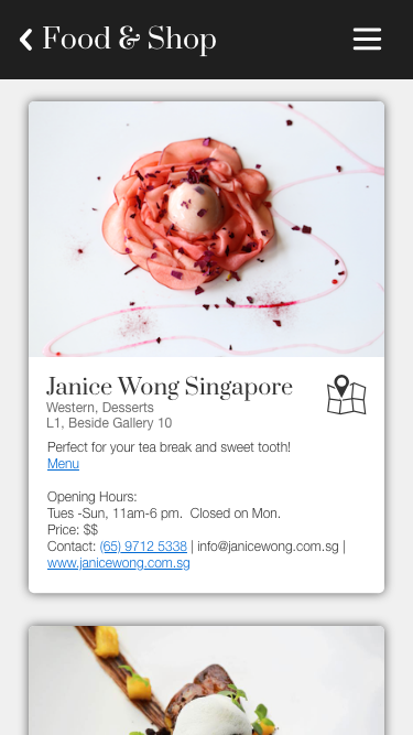
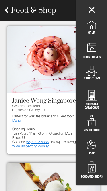
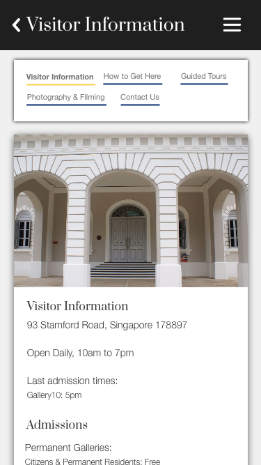
PROGRAMMES, FOOD AND SHOPS & VISITOR INFORMATION
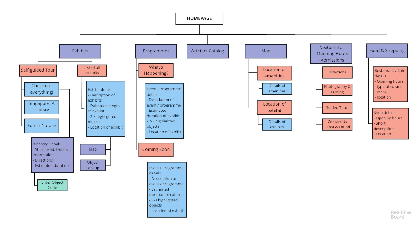
USER FLOW
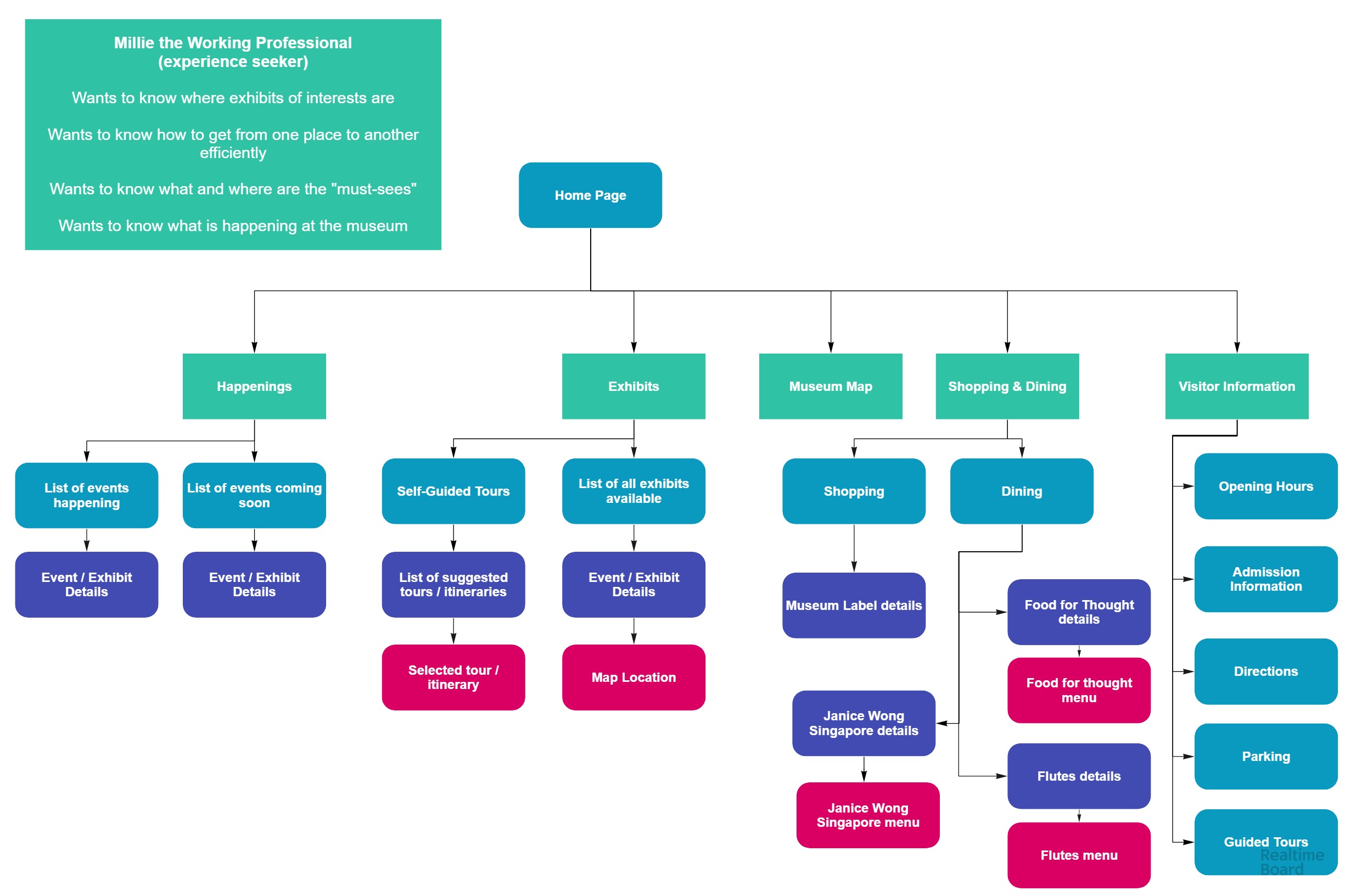
SITE MAP
Evaluation
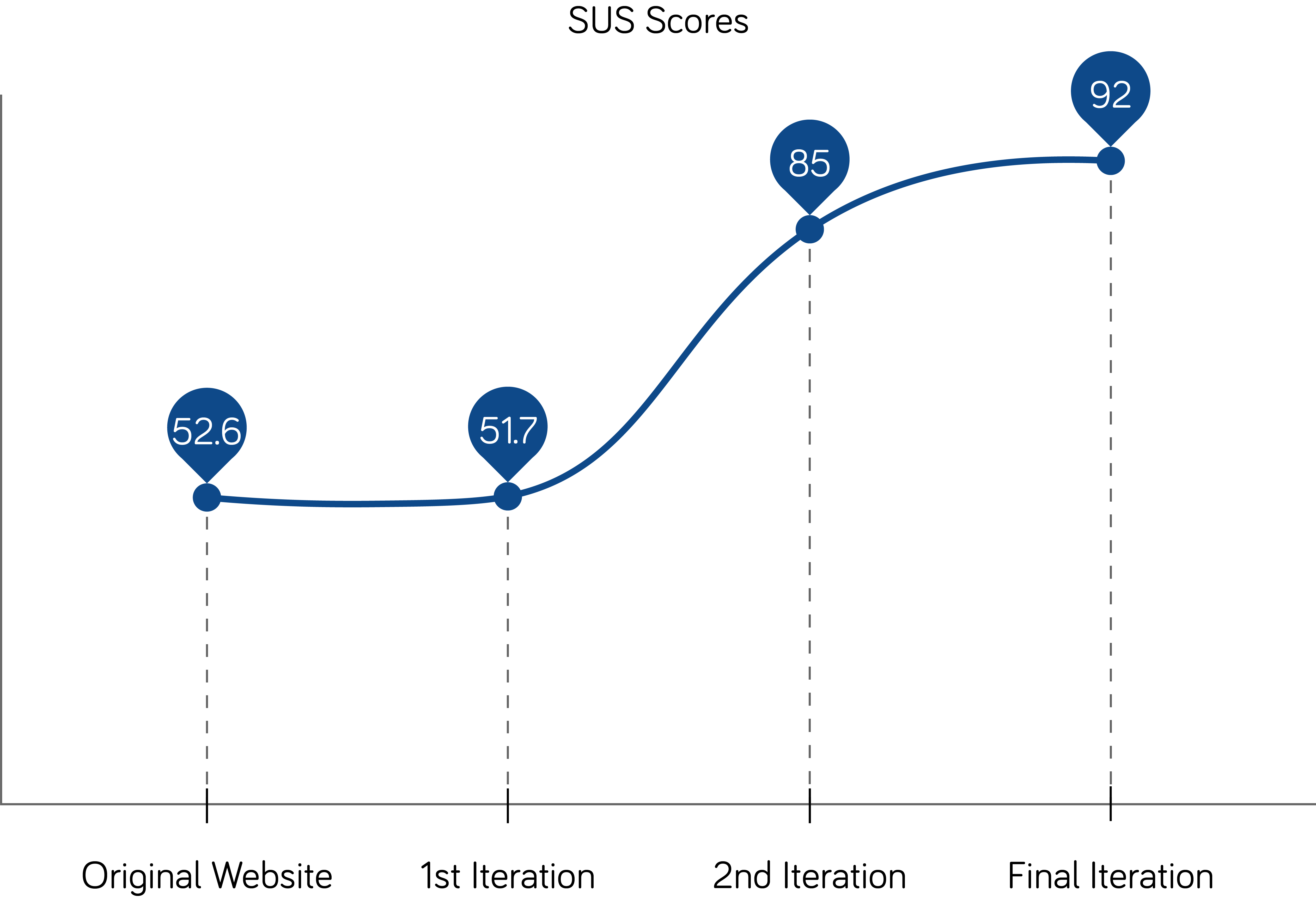
During the usability tests, we also took the System Usability Scale (SUS) scores to measure improvements
Original app: 52.6
First iteration: 51.7
Second iteration: 85
Redesigned app: 92